Julius Klinger (May 22, 1876–1942)
As one of the leading poster designers in history, Julius Klinger is responsible for developing many of the principles of design still used today. As a writer and educator, he devoted himself to creating a universal model of design based upon principles of negative space, simplification of form and colour, and the power of visual symbols. More importantly, Klinger sought to reconcile the applied arts with commerce and industry by reevaluating the role of the graphic artist in society.
Klinger was born in Vienna in a well-to-do Jewish family. Given his early gift for drawing, we don’t quite know why Klinger chose to attend a technical school associated with the Technological Trade Museum TGM) in Vienna rather than the Vienna Kunstgewerbschule (School of Arts and Crafts) or the Academy of Fine Arts- both of which focused on drawing and painting. Nevertheless, it is likely that the mathematics, engineering, and technical commercial drawing courses he was required to take, influenced his interest in type design and typographic grids later in his life.
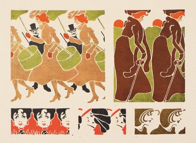
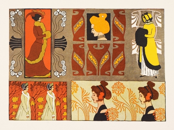
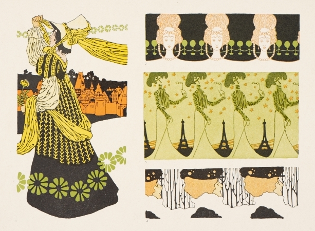
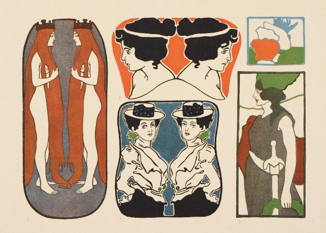
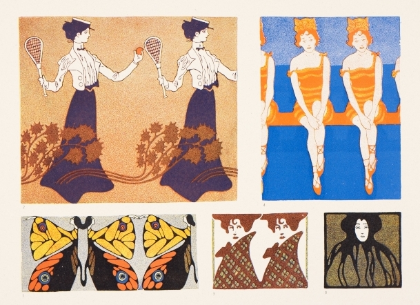
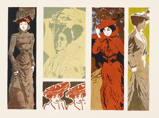
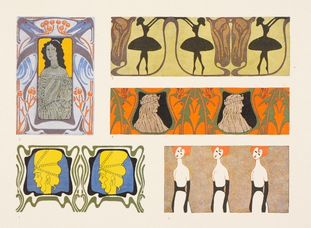
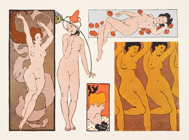
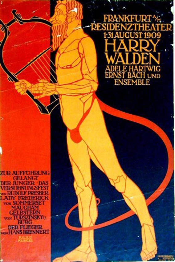
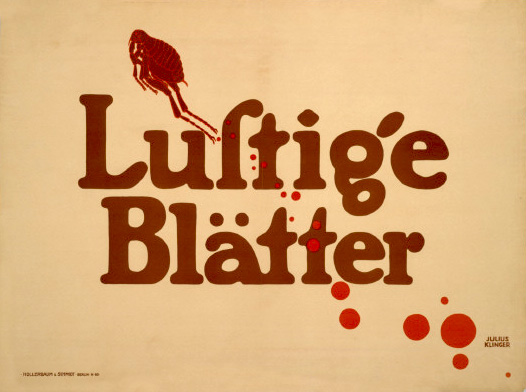
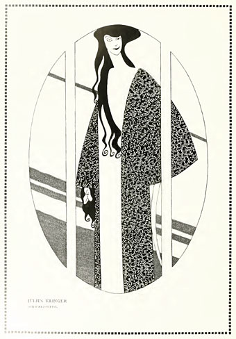
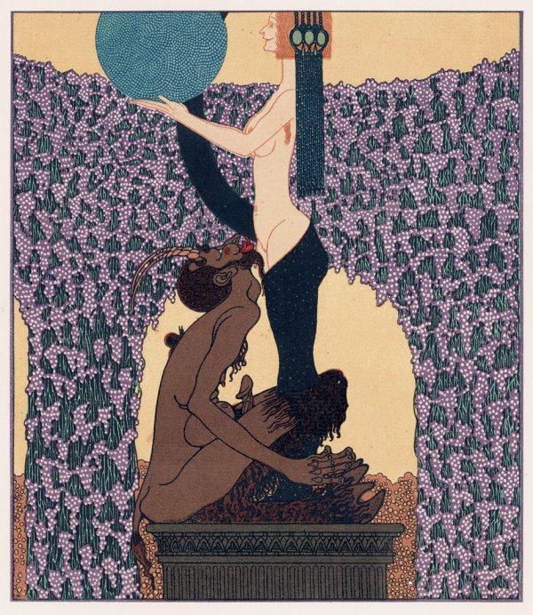
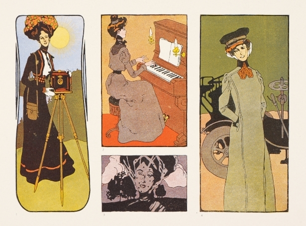
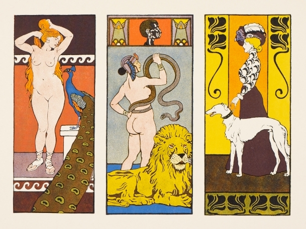
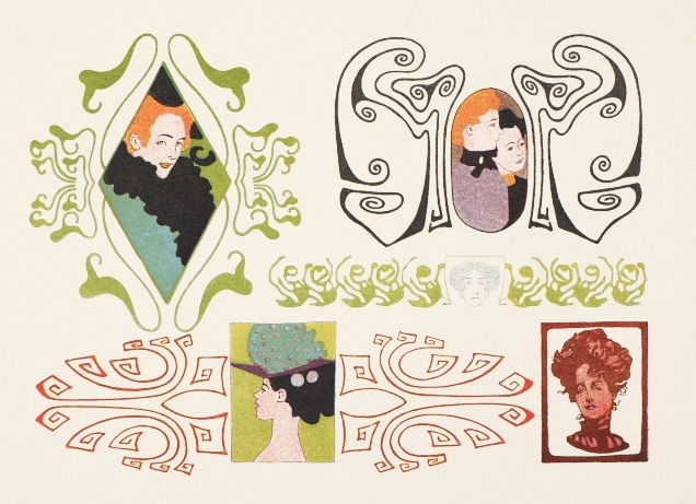
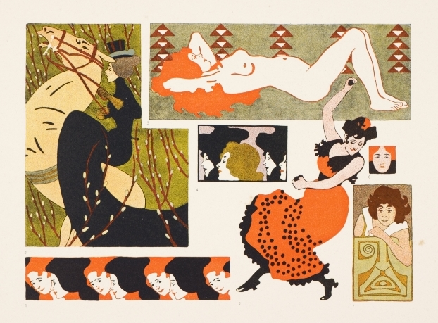
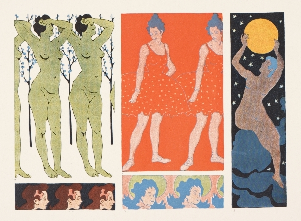
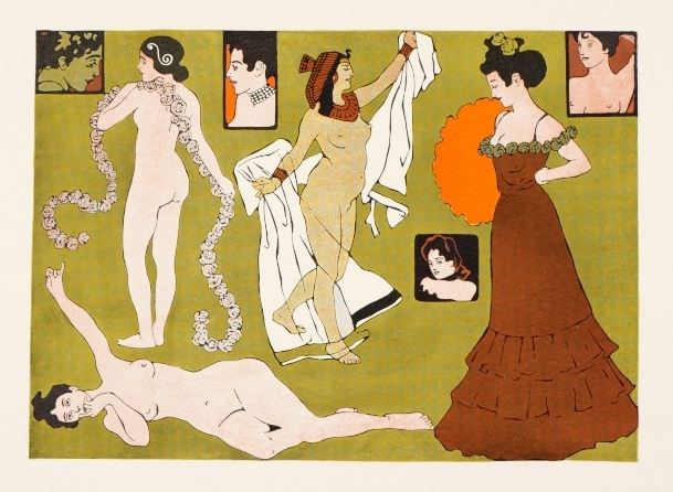
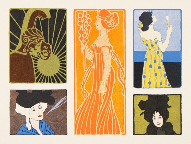
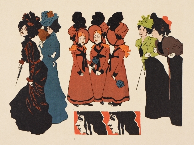
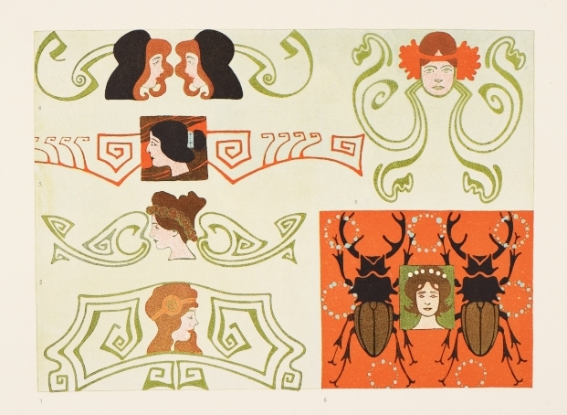
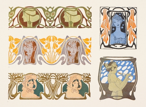
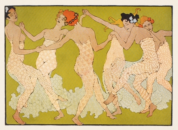
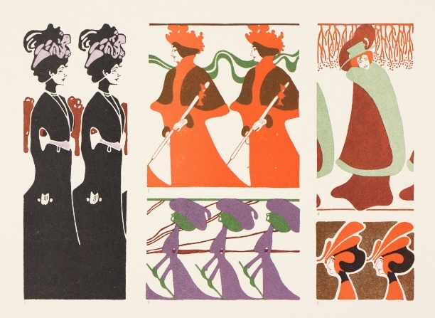
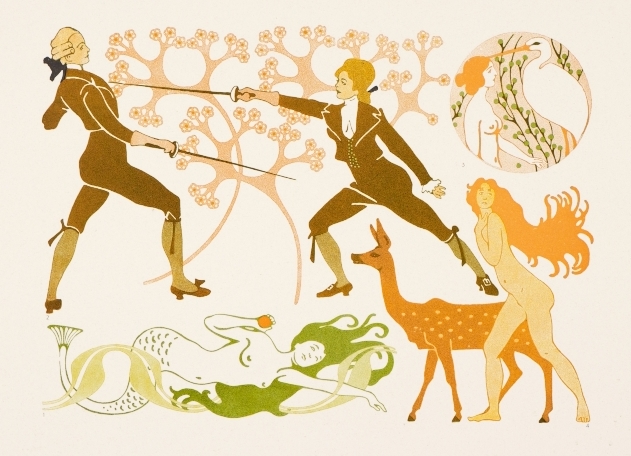
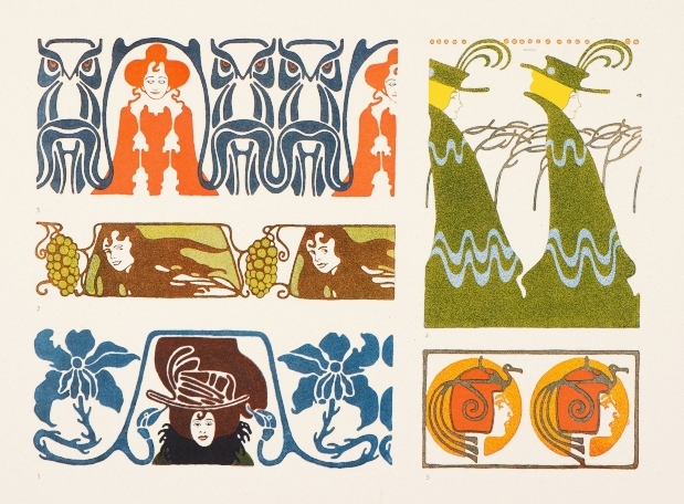
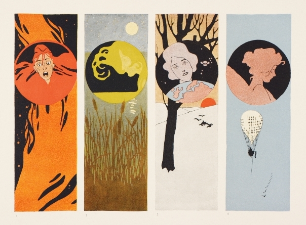
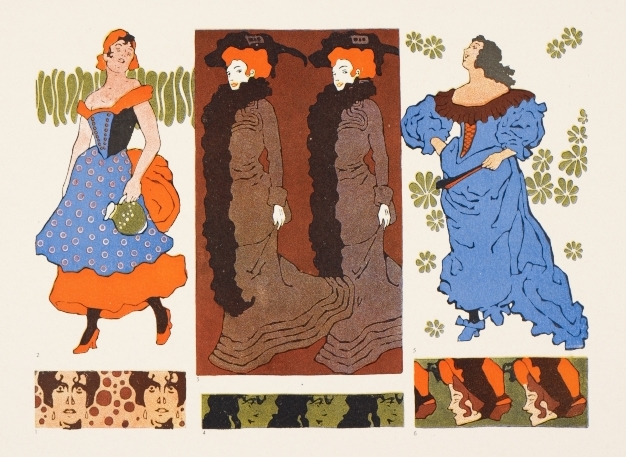
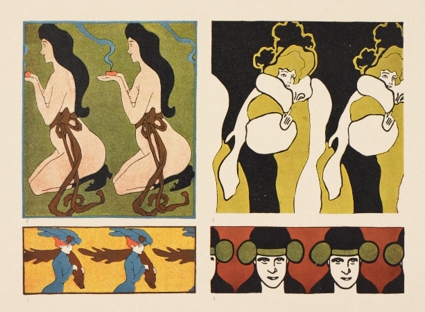
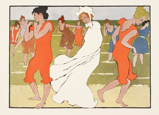
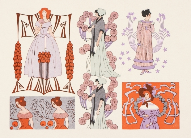
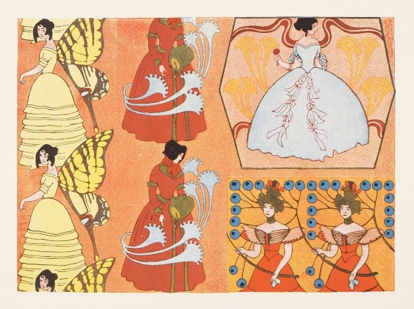
 During this time, Klinger became aware of the budding movement know as the Vienna Secession and sought out Koloman Moser – the group’s principle graphic artist– for private lessons. Moser’s influence is clearly evident in Klinger’s early pen and ink illustrations and poster designs, with flat fields of pattern and colour, decorative borders and frames, and Secession-style typography. Pattern design in particular play a central role in Klinger’s highly detailed illustrations for Deutsche Kunst und Dekoration and Lustige Blätter. In spite of their abundance of detail, these illustrations never resemble the excessive doodles so often found in art and design colleges today. Klinger’s balancing of intricate detail and negative space, geometric pattern and gestural line, all demonstrate his gift for restraint that the Jugendstil movement so often lacked.
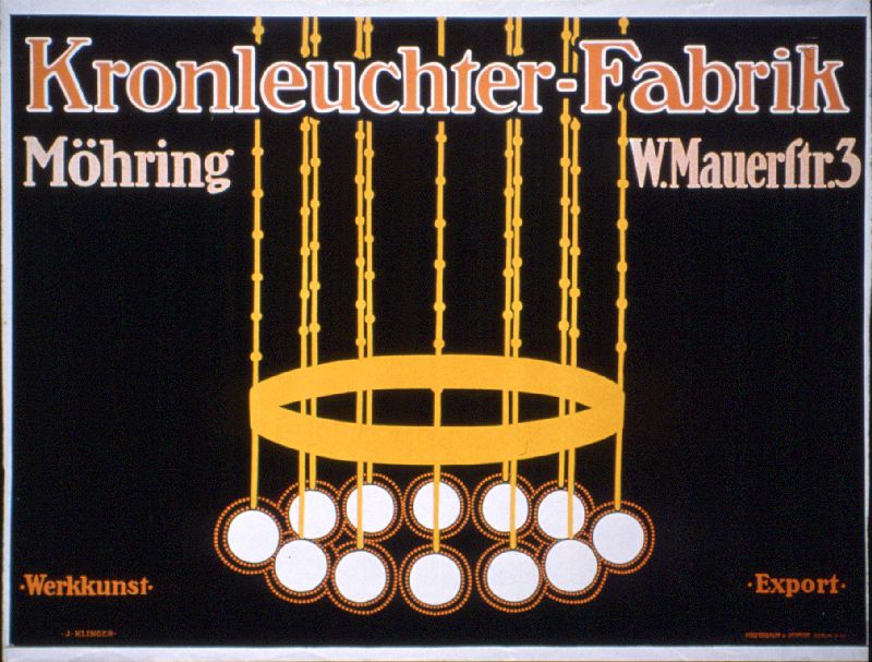
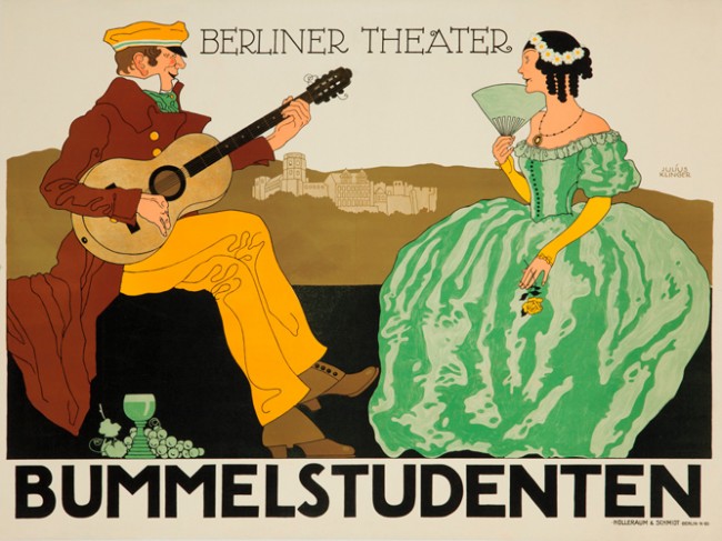
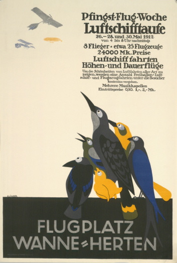
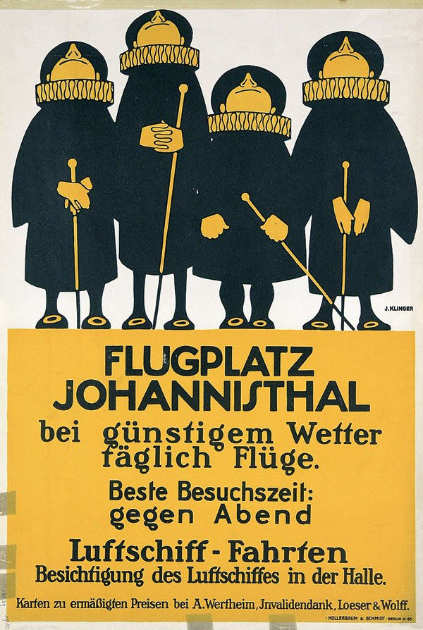
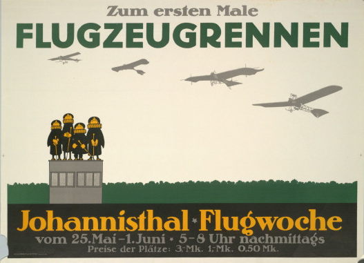
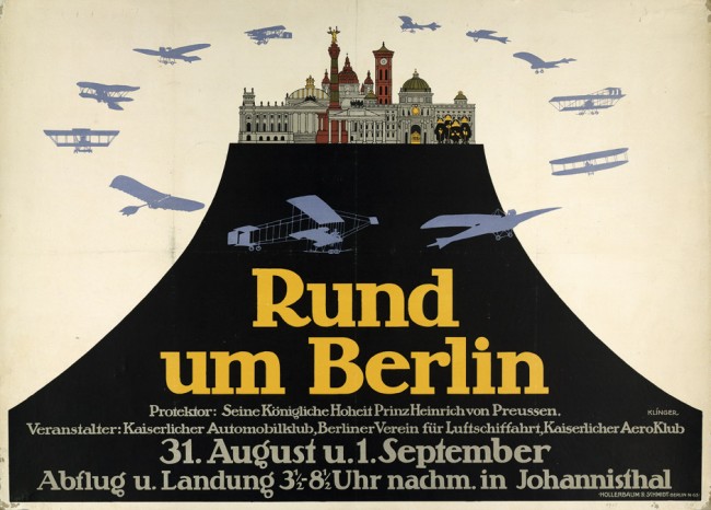
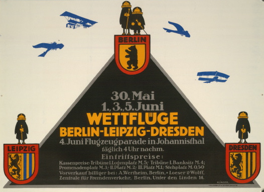
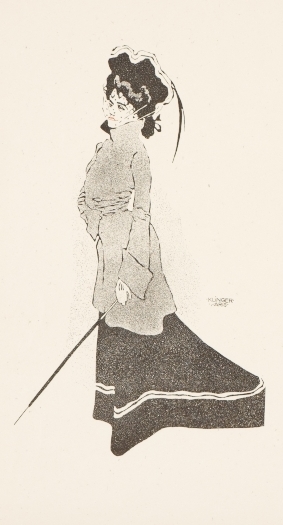
In 1895 Klinger moved first to Munich and then, two years later, to Berlin where he devoted much of his time to producing magazine illustrations and pattern books. While his work from this period is heavily oriented towards Jugendstil, Klinger began to abandon the excessive stylization and ornament. The distinct contour line associated with Jugendstil gradually disappears, as does the distinction between foreground and background. Stylized Jugendstil typefaces gradually make way for geometric sans serif typefaces.
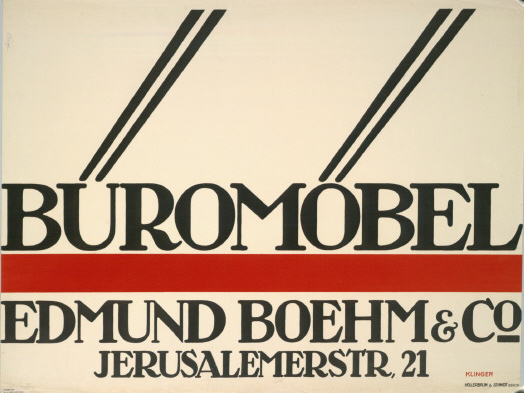
This shift in style might be in part a result of the fact that the majority of Klinger’s clients were in the areas of commerce, industry, and trade and as a result desired more legible communication materials. Furthermore, while Munich was the birthplace of Jugendstil, thanks to the journal Jugend, Berlin lagged behind in the field of decorative arts while establishing itself as one of the largest economic centres of Europe.
Another explanation for this shift might be Klinger’s developing philosophies on the role of the applied artist in society. Unlike the Vienna Secessionists who believed that the applied arts should exist within a Gesamkunstwerk (a total work of art) and therefore should be judged on the same level as the fine arts, Klinger believed that a distinction should be made between the two disciplines. The primary role of commercial art, he argued, was to convey a message and not serve as a vehicle for artistic expression. In this respect, Klinger was one of the earliest promoters of functionalism in the graphic arts whereby aestheticism should not obscure the practical purpose of the design.
Furthermore, he felt that the fragmentation of art institutions into small artist groups in Fin de Siècle Austria and Germany (the Vienna, Berlin, and Munich Secessions) reflected a growing divide between the art and business community. In a response to Benno Jaroslav’s 1912 book Ideal and Seschäft (The Ideal and Business), Klinger criticized the excessive aestheticizing of commercial art. He writes, “We want to produce our work well and with purpose so that it not only unburdens our conscience but also fulfils its intended function as a part of life. … The success of our effort will result from a slow and laborious evolution. That is our hope. Today, the businessman approaches says, present us with his wishes, and we are forced to submit to them. He frequently ignores your considerations and scruples, which results in work that does not satisfy us but to which we must sign our names. Nonetheless, I think there is no harm if our aesthetic sensibilities are occasionally slighted, since these matters are, after all, not so important that we should refuse to make any concessions. As long as we attempt to steadily develop and improve our work, we are doing our duty. If some misstep provides a potential target to unworldly aesthetes, it does us no damage. Slowly, the business world will understand that we are right about these things, just as we have recognized that the business world was right to curtail are excessively aesthetic ambitions…We are now experiencing a reaction to the excessive overrating of the decorative arts that occur 10 years ago.”¹
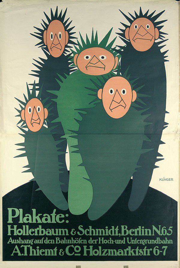
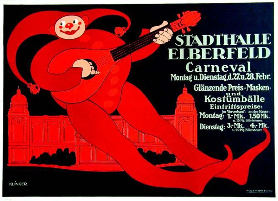
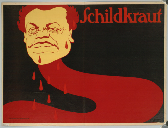
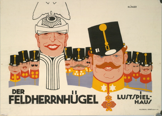
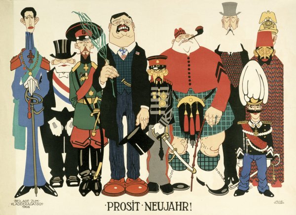
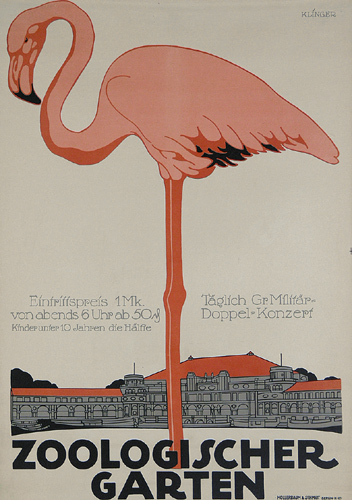
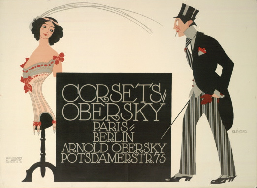
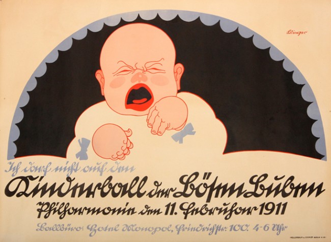
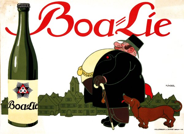
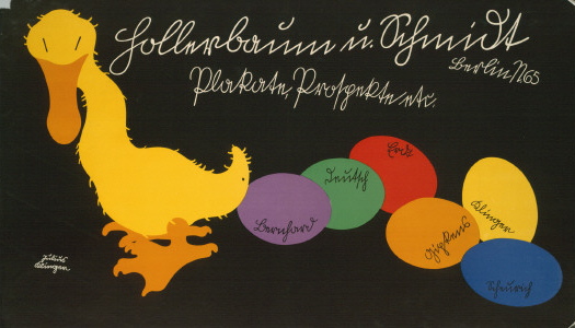
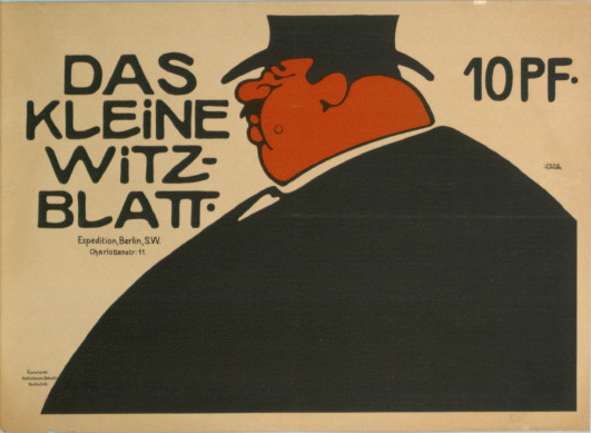
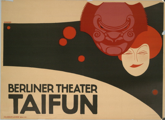
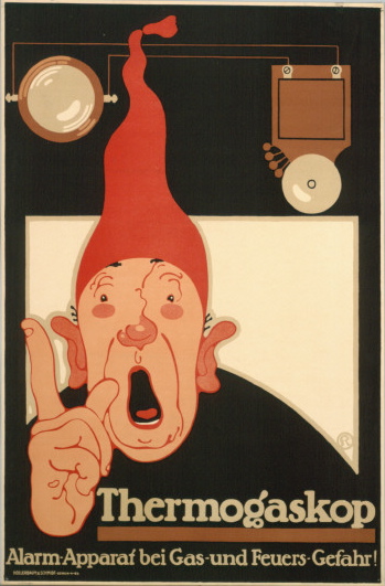
 The belief that the decorative arts had become overrated and pretentious may also explain the playful and humorous quality of some of Klinger’s work. He had by then sufficient experience with caricature and parody from his early days as an illustrator for the humour magazines Meggendorfer Blätter and Lustige Blätter, and therefore understood the power of humour in advertising. One version of his poster for Theatre Zoo Meyers created controversy when it was withdrawn because of its stereotyped representation of Jews. In a poster for Hollerbaum and Schmidt, Klinger took aim at his own profession depicting himself and the company’s other designers as cacti. For Klinger, humour was inextricably linked with illustration and opposed to the seriousness and intellectualism of the fine arts.
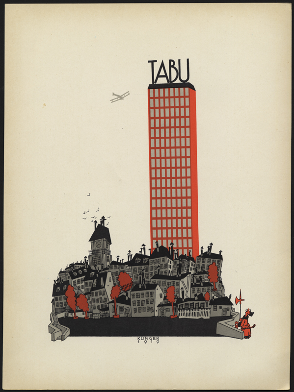
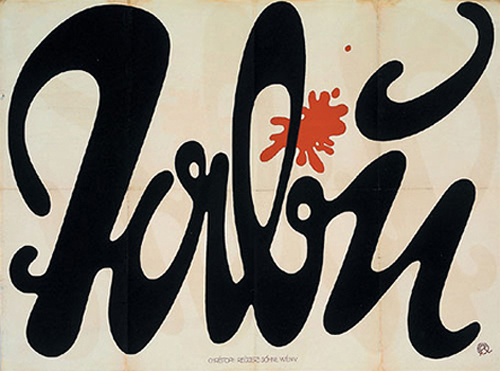
Throughout the 1920’s and 30’s, Klinger’s reputation as a commercial artist began to grow as he took on major commissions for numerous financial institutions in Austria and Germany. He also made several visits to the United State, first to Detroit in 1929 where he contributed art direction and again in New York in November 1931, where he taught courses in poster design. His admiration for the American model of productivity was evident in his advertising campaign for the tobacco manufacturer Tabu. Klinger cleverly used the image of the skyscraper towering over the old city as a symbol of urban growth and economic recovery.
Klinger’s style during this period also saw a sharp simplification of form and colour as he became an advocate of the ‘New Typography’ that was being developed by the Bauhaus and Jan Tschichold. The reduction of his colour palette to red and black, the use of sans serif typefaces, and the purging of illustration, were simply an extension of his early belief that the designers aesthetic style should be secondary to the functional purpose of the design to communicate the message.
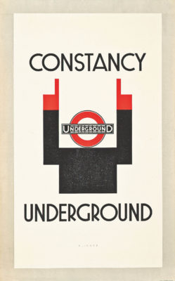
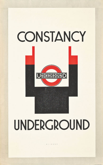
Klinger’s desire to simplify visual communication led to an increasing emphasis on the pictographic symbol over the written word. Referring to the ‘objective formal beauty’ of symbols on flags and signage, he stressed their power in the field of visual communication in their ability to transcend language and cultural associations, and convey a message much quicker than the written word. In his unpublished ‘The International Code’ c. 1926, Klinger elaborates on these ideas: “The visual sign predates the textual sign and engenders the latter. Over time the visual sign shed its bond with naturalistic motifs and transforms itself into an abstraction: a signal, seal, or code that is free of all connections to the natural world. By not requiring any explanatory text, word, or letter, the code illustrates its international utility. It is independent of every language”.² Klinger applied this theory to two posters for the London underground using way-finding symbols to convey punctuality, constancy and underground. For Klinger, the modern transportation system was a ultimate symbol of the potential of visual signs to express complex information with simple pictorial images.
-
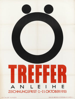
- Julius Klinger, Treffer, 1933.

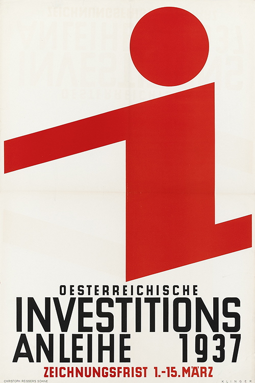
Klinger’s poster for the Osterreichische Invetitions Anhleih (Austrian Investments Bonds) in 1937 shows the culmination of his belief in symbols and New Typography. The logotype of the the letter ‘I’, which mimics the human figure in movement while also serving as a logotype for the company, simultaneously combines image and text and dominates the poster. The text, set in a sans serif typeface and centre justified, serves to contrast the dynamic logotype, by grounding the poster on a central axis. In a sense, it is symbol and text at odds with each other.
This would be one of the Klinger’s last commissions for a poster. The Anschluss in March of 1938 and racial laws that followed effectively put an end to his career and he was forced to scrape a living by giving private courses. He was eventually deported by the National Socialists on June 2,1942 to Maly Trostinets concentration camp where he was killed seven days later.
Roberto Rosenman, 2018.
Notes
¹ From “A Reply,” in Julius Klinger: Monographien Deutscher Reklamekunstler, 1912. Frits Meyer-Schoenbrunn, editor. Verlag von Fr. Wilh. Ruhfus, Dortmund, publisher.
² The International Graphic Code. Unpublished manuscript by Julius Klinger, c. 1926
-

- Julius Klinger, Treffer, 1933.


-

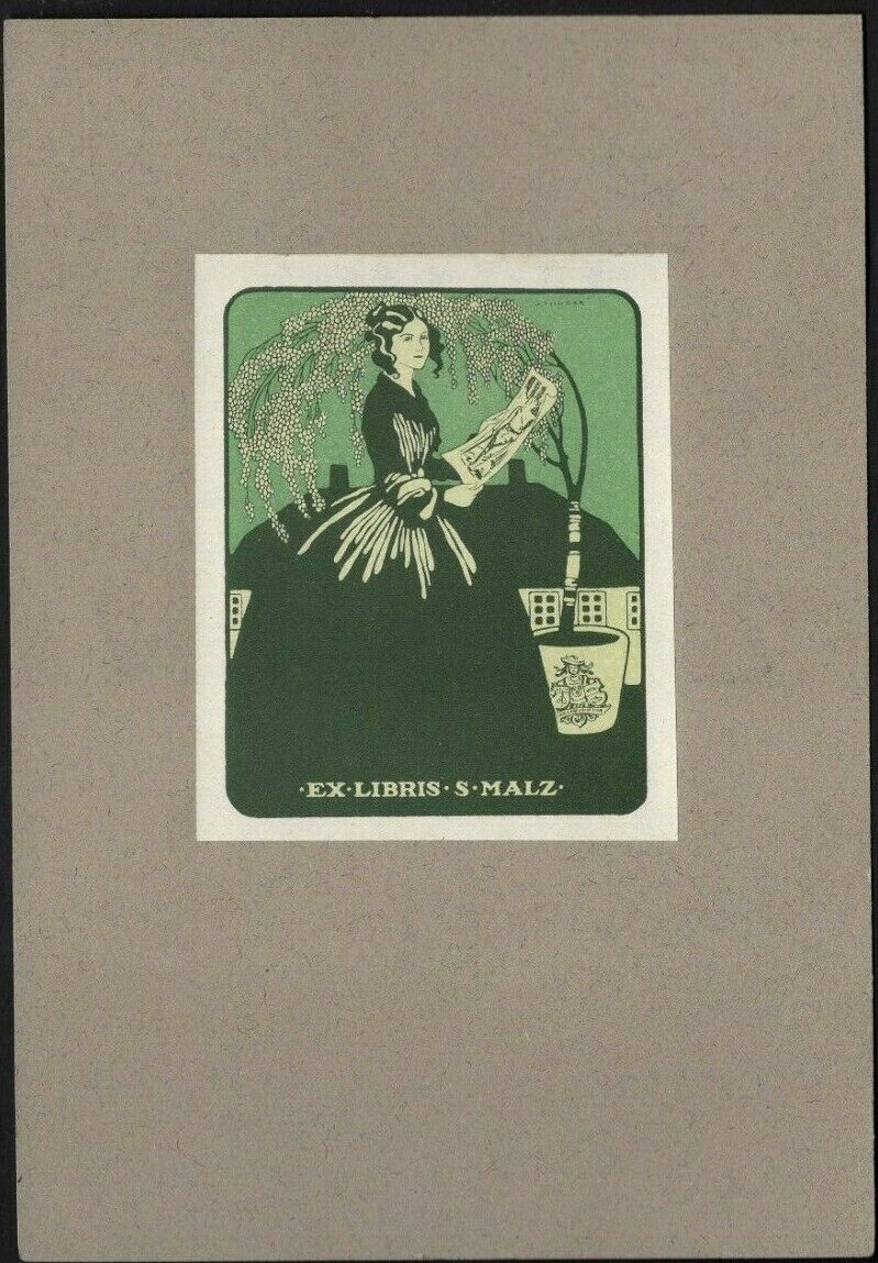
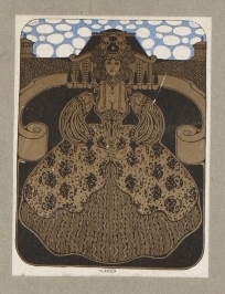
- Julius Klinger Exlibris for S. Malz
-
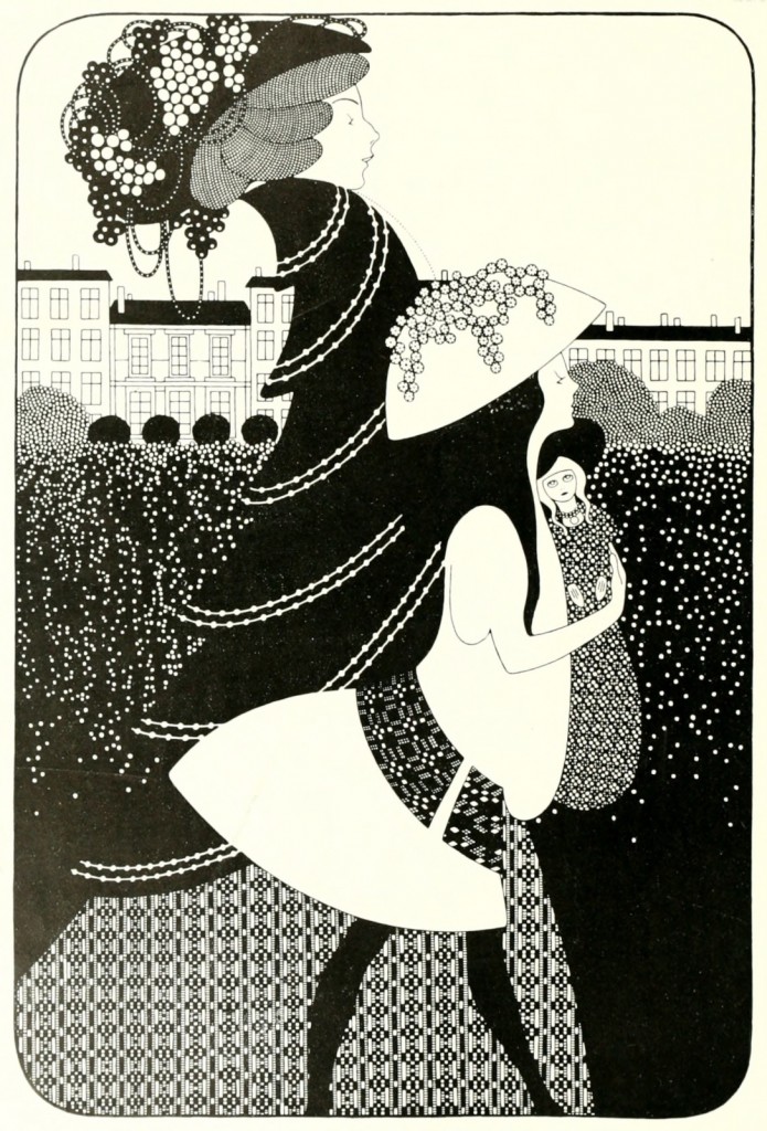
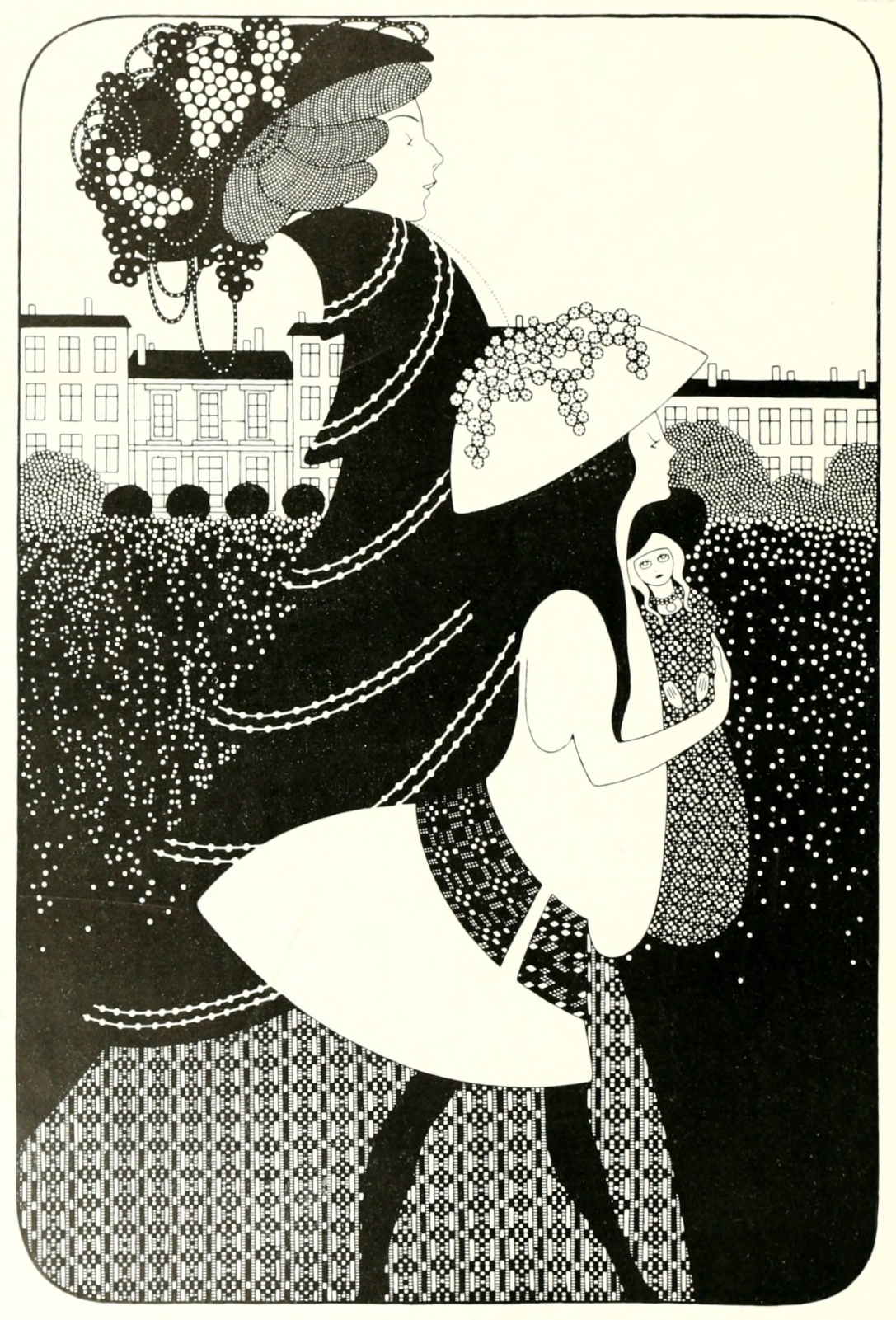
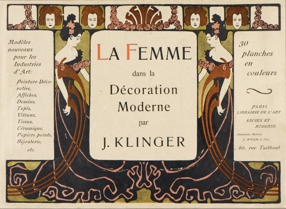
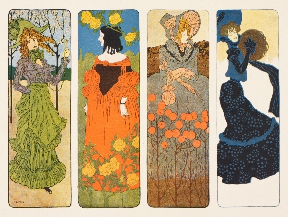
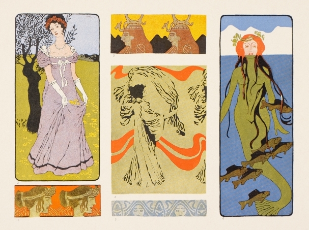
- Page from the portfolio ‘La femme dans la décoration moderne’, c.1902