
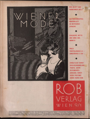
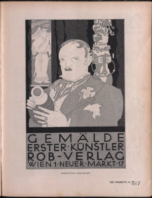
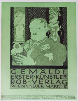
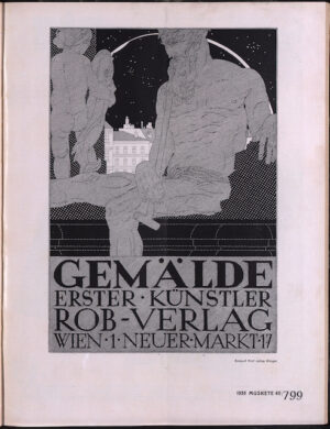
In a career that spanned nearly 4 decades, graphic artist Julius Klinger embraced a variety of different styles from Jugendstil, Art Deco, and eventually becoming an advocate of the ‘New Typography’ that was being developed by the Bauhaus and Jan Tschichold. One of the most interesting periods of Klinger’s is work is his contributions to the fashion and men’s lifestyle magazines Wiener Mode and Mocca Magazine, for the publishing house Rob-Verlag. Founded by publisher Karl Rob in 1916, Rob had already had success with his earlier satirical magazines Die Muskette and Wiener Klienes Witzblatt, both of which had featured Klinger’s illustrations.
-
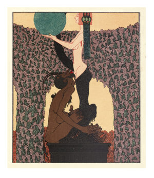
- Julius Klinger | Sodom: Ein Spiel (1909)
-
- Julius Klinger, Die Muskete, 19. November 1926
-
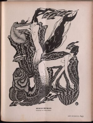
- Illustration in Deutsche Kunst und Dekoration #21. 1907-1908
-
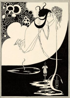
- Aubrey Beardsley, Illustrations for Oscar Wilde’s Salome, 1893. Photo: © Tate
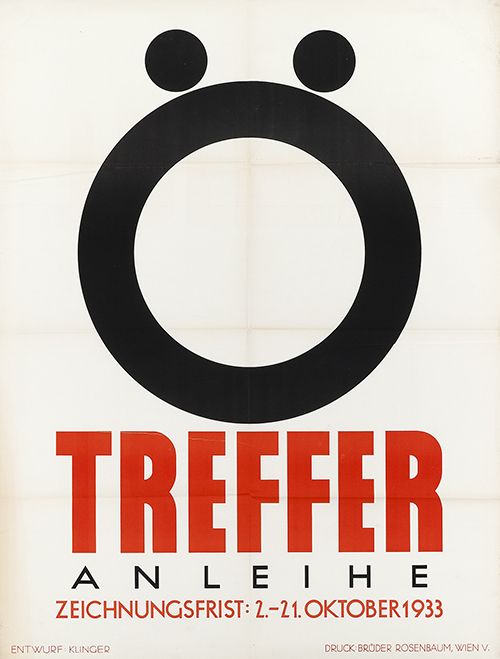
Julius Klinger, Treffer, 1933.
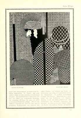
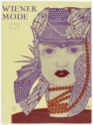
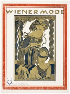
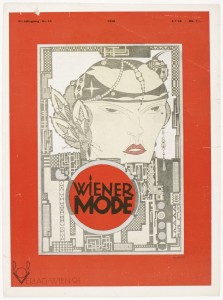
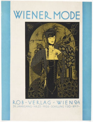
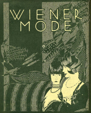
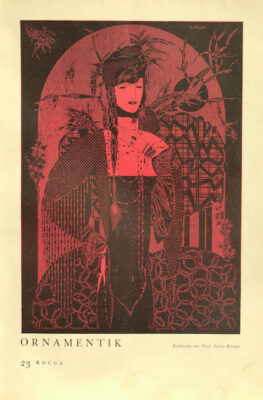
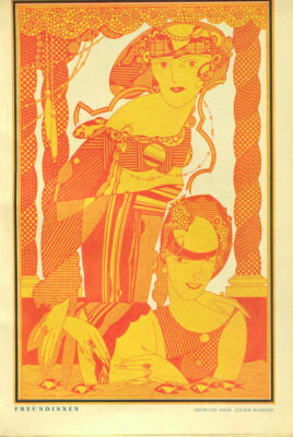
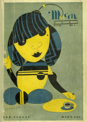
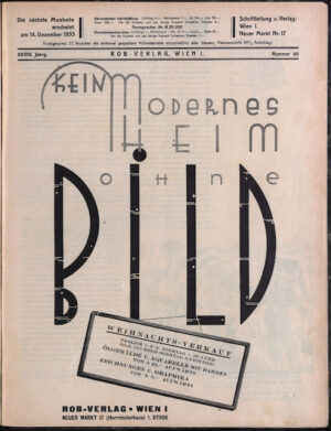
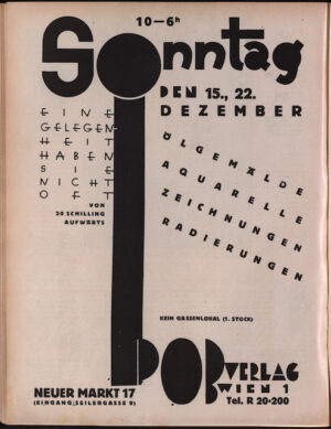
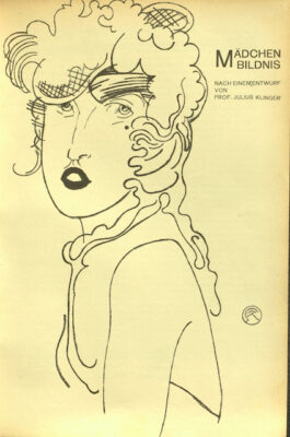
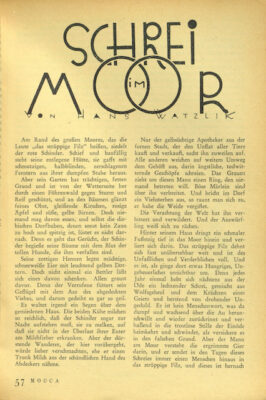
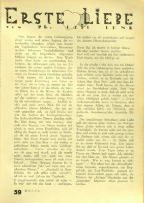
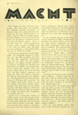
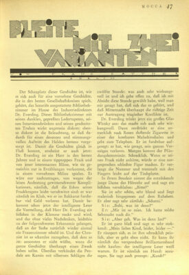
For both magazines, Klinger contributed both cover illustrations and typographic designs. The drawings show the influence of Art Deco, particularly in the geometrization of figurative forms and the absence of curvilinear forms that had dominated his earlier Jugendstil work. These illustrations also show his fascination with line, texture and pattern- a style that he had began exploring as early as 1909 for the private edition of the erotic play Sodom ein Spiel. The influence of the English graphic artist Audrey Beardsley is evident in his use for black ink to create areas of intricate detail as is his fascination with Japanese woodblock prints and the use of flat pattern design and asymmetrical compositions.
Looking at the intricate detail of these drawings, one might almost ignore the fact that Klinger shared views on the separation between commercial and fine arts with Adolf Loos—undoubtedly the the most rigorous critic of ornamentation who argued for functionalism over decoration in his 1908 essay Ornament and crime. Only a half a decade later, Klinger would further adopt many of Loos’ philosophies and develop a minimalist style that was completely stripped of decorative elements. Comparing his poster for Treffer in 1933 and his cover for Mocca 3 years earlier, one would almost think they were created by two separate artists. Yet this stark contrast shows Klinger’s incredible talent—to constantly adapt to changing styles and strip the composition down to the most essential elements necessary to communicate the message.
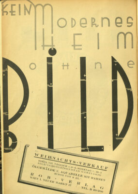
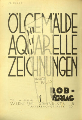
It’s also worth noting Klinger’s creative typographic designs within the pages of Mocca. While most are unsigned, we can attribute them to Klinger by the distinctive curve on the leg of ‘R’ which he used throughout his career. Klinger produced three commercial typefaces for type-foundries (Fette Antiqu 1898, Klinger Antiqua 1912, and Klinger Type 1926), but his his typographic designs throughout Mocca show his interest in decorative, expressive type design.
R. Rosenman, 2022
-
- Collection of The Wolfsonian FIU Library Collection
-
- Collection of The Wolfsonian FIU Library Collection
-
- Die Muskete, 17. Dezember 1926. Collection of Österreichische Nationalbibliothek/Austrian National Library
-
- Collection of The Wolfsonian FIU Library Collection
-
- Collection of The Wolfsonian FIU Library Collection
-
- Julius Klinger, Black ink drawing for Wiener Mode. Private collection of Roberto Rosenman.
-
- Mocca_feb, 1930. Collection of The Wolfsonian FIU Library Collection
-
- Mocca_October, 1930. Collection of Österreichische Nationalbibliothek/Austrian National Library
-
- Collection of Österreichische Nationalbibliothek/Austrian National Library
-
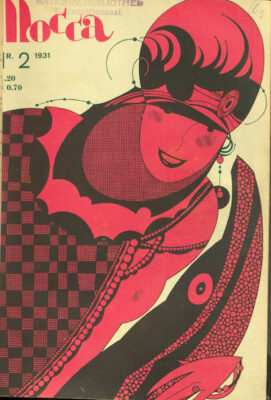
- Mocca, 1931. Collection of Österreichische Nationalbibliothek/Austrian National Library
-
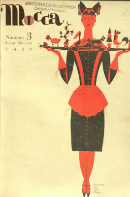
- Mocca, 1930. Collection of Österreichische Nationalbibliothek/Austrian National Library
-
- Collection of Österreichische Nationalbibliothek/Austrian National Library
-
- Collection of Österreichische Nationalbibliothek/Austrian National Library
-
- Collection of Österreichische Nationalbibliothek/Austrian National Library
-
- Wiener Mode, Nr. 21 1937
-
- Collection of Österreichische Nationalbibliothek/Austrian National Library
-
- Mocca. Jan 1934. Collection of Österreichische Nationalbibliothek/Austrian National Library
-
- Mocca_may, 1930. Collection of Österreichische Nationalbibliothek/Austrian National Library
-
- Mocca_June, 1930. Collection of Österreichische Nationalbibliothek/Austrian National Library
-
- Mocca_Nov, 1929. Collection of Österreichische Nationalbibliothek/Austrian National Library
-
- Mocca_June, 1931. Collection of Österreichische Nationalbibliothek/Austrian National Library
-
- Mocca May, 1929. Collection of Österreichische Nationalbibliothek/Austrian National Library
-
- Mocca-April 1929, Collection of Österreichische Nationalbibliothek/Austrian National Library
-
- Mocca, April 1929. Collection of Österreichische Nationalbibliothek/Austrian National Library
-
- Collection of Österreichische Nationalbibliothek/Austrian National Library
-
- Wiener Mode, Nr. 12, 1937
-
- Wiener Mode, 1937