
Ver Sacrum (‘Sacred Spring’ in Latin) was the official magazine of the Vienna Secession from 1898 to 1903. It’s advances in graphic design, typography and illustration set the model for later art magazine design and continues to influence magazine and book design to this day.
The first issue was released in January of 1898 with its arrival being announced in leading newspapers as a subscription journal. For the first two years, the journal was published monthly with each issue devoted to the work of a particular artist also in charge of designing the issue’s cover. In 1898, the July issue was devoted to the Czech art nouveau designer Alphonse Mucha, while the December issue was illustrated by Dutch symbolist painter Fernand Khnopff.
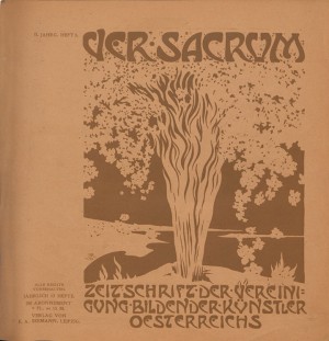
For the cover of the first issue, Alfred Roller provided an illustration of a blossoming planted tree with the roots breaking out of it’s container. The metaphor was appropriate – the Secessionists had freed themselves from the confines of the Kunstlerhaus (Vienna’s conservative exhibiting body) bringing their modernist and utopian message to the public. They wrote in the first issue: “Our aim is to awaken, encourage and propagate the artistic perception of our time….we know no difference between ‘great art’ and ‘intimate art’, between art for the rich and art for the poor. We have dedicated ourselves with our whole power and future hopes, with everything that we are to the Sacred Springtime”. [i]
This name chosen for the magazine: Ver Sacrum (Sacred Spring) was a classical reference to the secession of youths from the elders of the city to found a new society. This idea of youth as a symbol of rebellion and innovation was nothing new, it was the very heart of the Jugendstil movement and the Lebensreform movement (life reform) that accompanied it. Yet, while Jugendstil rejected historicism, the Vienna Secession embraced it- drawing analogies between themselves and the ancient youths but also recognizing that modernism could co-exist with the ideals of classical art.
The release of the first issue was pre-mature given that it was eleven months before the opening of the Joseph Olbrich Secession House and 3 months before their first exhibition in the Horticultural hall. However, one can look at the early release as a dress rehearsal for many of the ideas that would be developed in their exhibitions. Ver Sacrum served as an exhibition in itself, using the blank pages as walls in a museum. The magazine’s principle designer, Koloman Moser, approached the layout with great creativity, constantly altering it within whilst creating a beautiful harmony of text and illustration. When Olbrich’s Secession House did begin to hold exhibits, this same modular approach to picture arrangement was adopted by Olbrich and Josef Hoffmann through the unique use of moving partitions and walls within the structure.
In both its harmony of text and image and in its inclusion of multiple art forms, Ver Sacrum was a manifestation of composer Richard Wagner’s ideas of ‘Gesamkunstwerk’- a total work of art. In one of Alfred Roller’s entries as Secession secretary from June 1897, he discusses the idea for the magazine that would encompass all the arts: “Moser suggested publishing an art magazine as an official organ of the association. Directive: the fine arts, poetry and belles-lettres. Prose will not be excluded if joined with fine art.[ii] The magazine did in fact live up to this goal; including, in addition to fine and graphic arts, music, poetry, and theatre into its pages. The poems of Rainer Maria Rilke appeared in 1898 and 1899 issues, juxtaposed with stunning decorative borders by Koloman Moser while the December 1901 issue was devoted entirely to music, featuring 11 richly illustrated lieder by contemporary Austrian.
Most unique of all was the magazine’s square format—a radical new step in the design of periodicals. The square, and more so the grid, had found its way from the Scottish Arts and Crafts movement, particularly in the work of Charles Mackintosh who became a corresponding member if the Secession. This format offered new possibilities in layout for the designer’s use of multiple text columns, decorative borders, and negative space. The square format became their ideal aspect ratio as most of their illustrations were executed in this format, while Klimt chose it for the majority of his landscape paintings. Years later, The Dutch Art-Deco periodical Wendingen would also adopt the square format and push the limits of typographic and layout design even further.
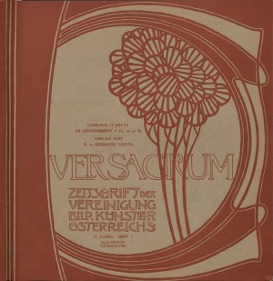
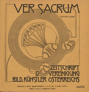
Ver Sacrum ceased production in December 1903, likely because of lack of funds. It had already seen a gradual decline in its quality in 1900 when, production increased to 24 issues a year, but in a much smaller and slimmer format than those produced in the first two years. The unique changing covers from 1898-99 were replaced with a repeating masthead, and text replaced much of the graphic borders and motifs.
[i] Ver Sacrum, January 1898, 24.
[ii] Alfred Roller, Notes of the Secession meetings kept by Roller in personal notebooks. (Alfred Roller archive, Osterreischisches Theatre Museum, Vienna: AR6).
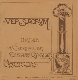
The Covers
1898
-
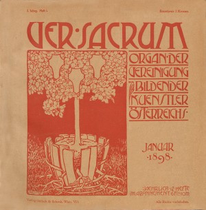
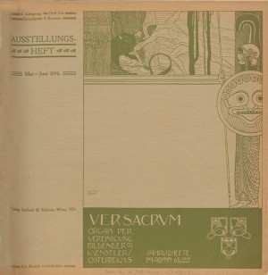
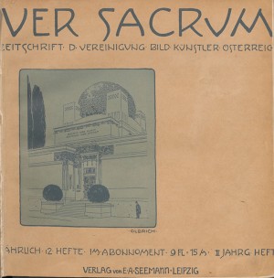
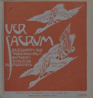
- 1898- Heft 1. Cover by Alfred Roller.
-
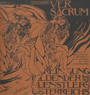
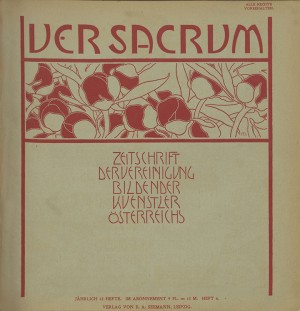
- 1898- Heft 2. Cover by Koloman Moser
-
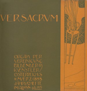
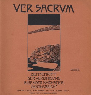
- 1898, Cover by Gustav Klimt
-
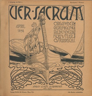
- 1898, Heft 4. Cover by Rotenfeld.
-
- 1898-heft 5/6 (Double Issue) Cover by Gustav Klimt.
-
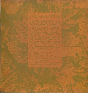
- 1898, heft 7 . Cover by Alfred Roller.
-
- 1898- Heft 8
-
- 1898- Heft 9
-
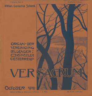
- 1898- Heft 10.
-
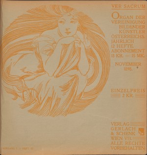
- 1898- Heft 11. Cover by Alphonse Mucha
-
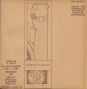
- 1898 Heft 12- Cover by Fernand Khnopff
-
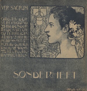
- 1898- Sonderheft 1 (extra issue)
1899
-
- 1899-Heft 1. Cover by Joseph Olbrich
-
- 1899-Heft 2
-
- 1899- heft 3. Cover by Emil Orlik(?)
-
- 1899 Cover by Koloman Moser
-
- 1899- heft 5. Cover by Alfred Roller.
-
- 1899- Heft 6. Cover by Adolf Böhm
-
- 1899- Heft 7. Cover by Josef Hoffmann
-
- 1899- Heft 8
-
- 1899- heft 9. Cover by Emil Orlik(?)
-
- 1899- Heft 10