
Art and Satirical Magazines in Fin de Siècle Germany and Austria
Roberto Rosenman
One of the unlikely outcomes of the rise of urbanization and universal education in the late 19th century was the change in reading habits from books to magazines and newspapers. As the lower classes became more politically aware, magazines were a means for them to be kept abreast of social issues while also serving, through satirical magazines, as an outlet for political dissent. German and Austrian art and satirical magazines in particular experienced a boom in the Fin de Siècle as the emergence of Art Nouveau found a ready market with readers eager to embrace modernism. Between 1888 and 1900, there were 2,150 new magazines and newspapers founded in Germany alone, with circulations from 50,00 (Kladderadatch) to as many as 600,000 (Berliner Illustrierte).[1]

Newspaper reading inside Café Griensteidl, Vienna. (Image by Carl von Zamboni)
Reflecting on his life in Fin de Siècle Vienna, the writer Stefan Zweig credited the numerous magazines and newspapers available at Viennese coffeehouses with having given him the best possible education on everything that was new. The coffeehouse became a common meeting place for artists and writers like Zweig to exchange ideas while also offering an opportunity to partake in the hundreds of newspapers and magazines, all for the price of a cup of coffee. (Image #1) The Siebener Club group (the Seven Club), which would go on to form the Vienna Secession, met regularly at the Café Sperl while the Hagendbund met at the Café Blauhaus. Sigmund Freud was a regular patron of Café Landmann, and Gustav Mahler of the Café Imperial. Many of the patrons of coffeehouses were ‘Bettgeher’ (Bed-goers)—lower middle-class Viennese who lived in the overcrowded poor districts, often with seven people in a room and no indoor toilets or running water. [2] These coffeehouses offered a refuge from their drab housing conditions and most importantly, an opportunity to partake in the hundreds of newspapers and magazines on offer, all for the price of a cup of coffee. In Café Central in Vienna, patrons could choose from over two hundred Austrian and international publications. Zweig would have undoubtedly been exposed to the growing number of art and satirical magazines like Jugend, Ver Sacrum, and Meggendorfer Blätter which helped spread Art Nouveau throughout Germany and Austria and made important contributions to the areas of graphic design, typography and illustration.
JUGEND
Perhaps the most popular of art magazines was Jugend, (1896-) best known today for its particular role in popularizing Art Nouveau in Germany. As the style spread from France to Germany, it was given the name Jugendstil (in the style of Jugend) after the magazine, which first introduced it to the Munich public.
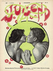
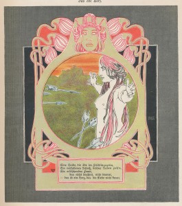
The magazine was the idea of George Hirth, a Munich-based writer, journalist, and co-owner of the daily newspaper Münchner Neuest Nachrichten (1848–1945). With a passion for philosophy, nature, and art, Hirth became friends with zoologist philosopher Ernst Heckel and shared his interest Monism, becoming the co-founder of the Monist society of Munich. He also took a keen interest in the Theosophy movement, forming a relationship with Theosophist artist Hugo Höppener (1868 – 1948). Under the pseudonym Fidus, Höppener would create hundreds of illustrations for the magazine, often depicting nude youth in idealized natural surroundings. (Image #2) Images like these, along with depictions of nymphs, centaurs, and satyrs, contributed to the association of Jugendstil with the Lebensreform movement (life reform), which encouraged a return to a ‘natural’ lifestyle while simultaneously opposing the stuffiness of academicism. Illustrations like Fidus’ undoubtedly helped increase the magazine’s popularity as readers saw the escapism that Jugend offered as a respite from the social realities that were depicted so cynically in contemporary magazines. In the first year alone, Jugend enjoyed a readership of 20,000 a week. [3] In referring to Jugend in his book on the principles of book and magazine design, Walter Crane referred to this distinctly Southern German ‘joie de vivre’ expressed in the illustrations of the magazine, “(Jugend) showing that there are many clever artists with a more or less decorative aim in illustration, which in others seems rather overgrown with grotesque feeling and morbid extravagance, but there is an abundance of exuberant life, humour, whimsical fancy, and spirit characteristic of South Germany.” [4]
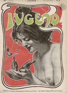
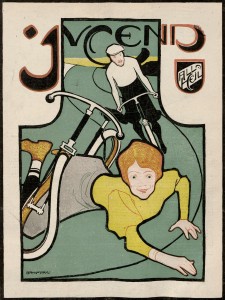
While Jugend’s literary and satirical contributions are considered mediocre compared to other contemporary humour magazines like Simplicissimus, its richly coloured graphic art sets it aside from other predominantly text-based and monotone-printed magazines. Unlike previous magazines that had been produced with the intention of being discarded after reading, Hirth intended for Jugend to be collected, a trend that had already begun with the collecting of posters and postcards. To achieve this, he had a different artist design the cover art and masthead, which were printed in rich, full colour. Artists like Hans Christiansen, J.R. Witzel, Otto Eckmann, and Bruno Paul incorporated elements of poster design whereby the masthead and illustration were combined in a unified design. In 1909, Hirth published a book which featured 3000 reproduced covers and illustrations from the magazine’s first twelve years- a testament to the public’s fascination with its graphic content.
VER SACRUM
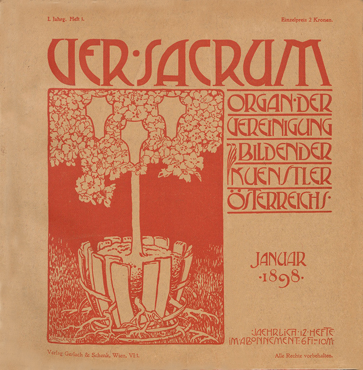
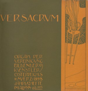
1898- Heft 1. Cover by Alfred Roller.
Of all the art periodicals printed in Fin de Siècle Vienna, Ver Sacrum-Organ der Bildender Vereinigung Kunstler Osterreichs, the official journal of the Vienna Secession, remains the most ambitious and groundbreaking. Using the earlier art magazine Pan as its model, the editors sought to create an avant-garde journal that would be, through its inclusion of multiple art forms, a manifestation of a ‘Gesamtkunstwerk’- a total work of art. In one of Alfred Roller’s entries as Secession secretary from June 1897, he discusses the idea for the magazine that would encompass all the arts: “Moser of the fine arts, poetry and belles-lettres. Prose will not be excluded if joined with fine art”.[5] In addition to fine and graphic arts, it featured poetry by Rainer Maria Rilke, the plays of Gerhard Hauptmann, and an entire issue devoted to lieder by contemporary Austrian composers. Ver Sacrum also explored new ideas in graphic design, typography and illustration. The term ‘graphic design’ was not yet established when art journals like Ver Sacrum began to give consideration not only to content but also to their design. It was only in 1922 when American designer William Addison Dwiggins first used the term in order to distinguish between utilitarian printing and printing for purpose.[6] Up until this point the graphic arts were generally practiced by artists trained at art academies who; in addition to being painters, worked as type designers, illustrators, poster designers, and book designers. It is thanks to this lack of distinction between fine art and graphic art that we find such varied and rich examples of design and illustration within the pages of Ver Sacrum.
For the cover of the first issue, Alfred Roller provided an illustration of a blossoming potted tree with the roots breaking out of its container. The metaphor was appropriate – the Secessionists had freed themselves from the confines of the Kunstlerhaus (Vienna’s conservative exhibiting body) bringing their modernist and utopian message to the public. They wrote in the first issue: “Our aim is to awaken, encourage and propagate the artistic perception of our time….we know no difference between ‘great art’ and ‘intimate art’, between art for the rich and art for the poor. We have dedicated ourselves with our whole power and future hopes, with everything that we are to the Sacred Springtime”. [7]
The name chosen for the magazine: Ver Sacrum (Sacred Spring) was a classical reference to the secession of youths from the elders of the city to found a new society. This idea of youth as a symbol of rebellion and innovation was nothing new; it was the very heart of the Jugendstil movement and the Lebensreform movement that accompanied it. Yet, while Jugendstil rejected historicism, the Vienna Secession embraced it- drawing analogies between themselves and the ancient youths while also recognizing that modernism could co-exist with the ideals of classical art.
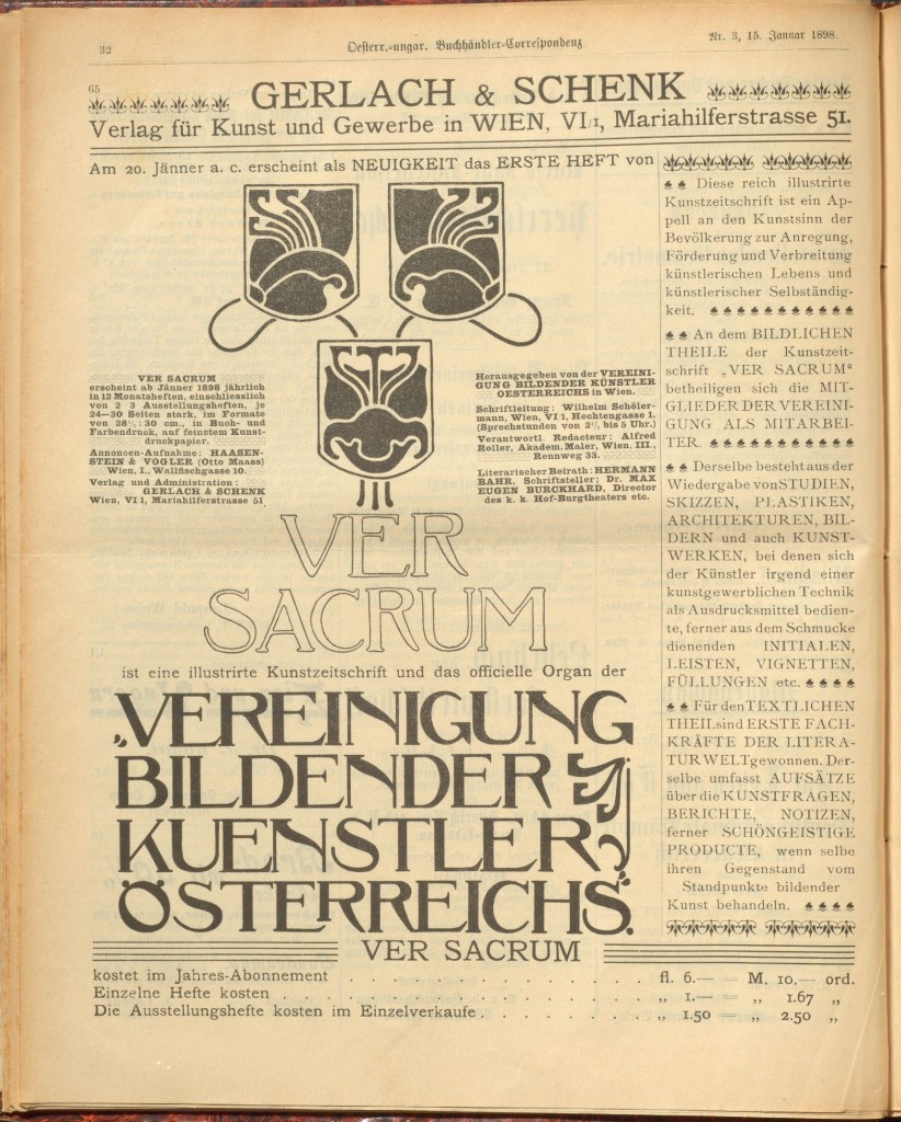
Advertisement announcing the arrival of Ver Sacrum.
The release of the first issue was premature, given that it was eleven months before the opening of the Joseph Olbrich Secession House, and three months before their first exhibition in the Horticultural Hall. However, one can look at the early release as a dress rehearsal for many of the ideas that would be developed in their exhibitions. From the onset, the Secessionists saw Ver Sacrum as an extension of its exhibitions, using the blank pages as walls in a museum. The magazine’s editor Alfred Roller outlined his vision for the magazine in a letter to Gustav Klimt in 1898, “Each volume should be a small exhibition, and the whole of Ver Sacrum a great one.”[8] The magazine’s principal designer Koloman Moser set about to achieve this very aim by constantly altering the layout of each page whilst creating a beautiful harmony of text and illustration. When Olbrich’s Secession House did begin to hold exhibits, this same modular approach to picture arrangement was adopted by Olbrich and Josef Hoffmann through the unique use of moving partitions and walls within the building.
Unlike contemporary journals, which recycled the same stock decorative borders and letters from story to story, the Secessionists ensured that every graphic element in Ver Sacrum adhered to their Secession style and was never repeated. In any given feature, the designer of the decorative borders and vignettes was credited alongside the featured artist or writer, implying that there was no distinction between fine art and graphic arts. The desire to maintain stylistic unity was even carried forth in the advertisements designed by Josef Hoffmann and Koloman Moser on the inside front and back of the journal which incorporated the same Secession-style typography and illustration within the magazine.
Most unique of all was the journal’s square format—a radical new step in the design of periodicals. The square and more so the grid, had found its way to Austria from the Scottish Arts and Crafts movement, particularly in the work of Charles Rennie Mackintosh. It quickly became the Secessionists’ preferred aspect ratio with Gustav Klimt choosing it for the majority of his landscape paintings. This format offered new possibilities in the use of multiple text columns, decorative borders, and negative space. (Image #12) More so, it removed the distinction between text and picture frame by the very fact that the reader no longer had to tilt the magazine on its side to view a landscape format image. In reviewing the first issue, journalist Ludwig Hevesi praised the effect the new format had on the reader, “A glance at the first issue of this new magazine reveals– even before one has to start to leaf through the pages– that the artist knows what he wants. Already the format is telling; these people do not want you to be forced to turn the whole magazine only to be able to marvel at the occasional landscape format picture. The canvas-like quality of the cover, the light ochre shade of the background, the atmosphere red colour print and the singular effect that both elements combined create together; add the mastery of image and font, negative and positive space are combined– the reader has to believe us that such a cover is a work of art that does not appear every day.”[9] Years later, the Dutch Art-Deco periodical Wendingen would also adopt the square format and push the limits of typographic and layout design even further.
-
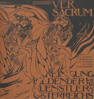
- 1898, Cover by Gustav Klimt
-
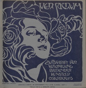
- 1898- Heft 2. Cover by Koloman Moser
-
- 1899 Cover by Koloman Moser
Ver Sacrum ceased production in December 1903, likely because of a lack of funds. It had already seen a gradual decline in its quality in 1900 when production increased to 24 issues a year, but in a much smaller and slimmer format than those produced in the first two years. The unique changing covers from 1898-99 were replaced with a repeating masthead, and text replaced much of the graphic borders and motifs.
DEUTSCHE KUNST UND DEKORATION
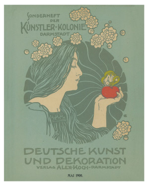
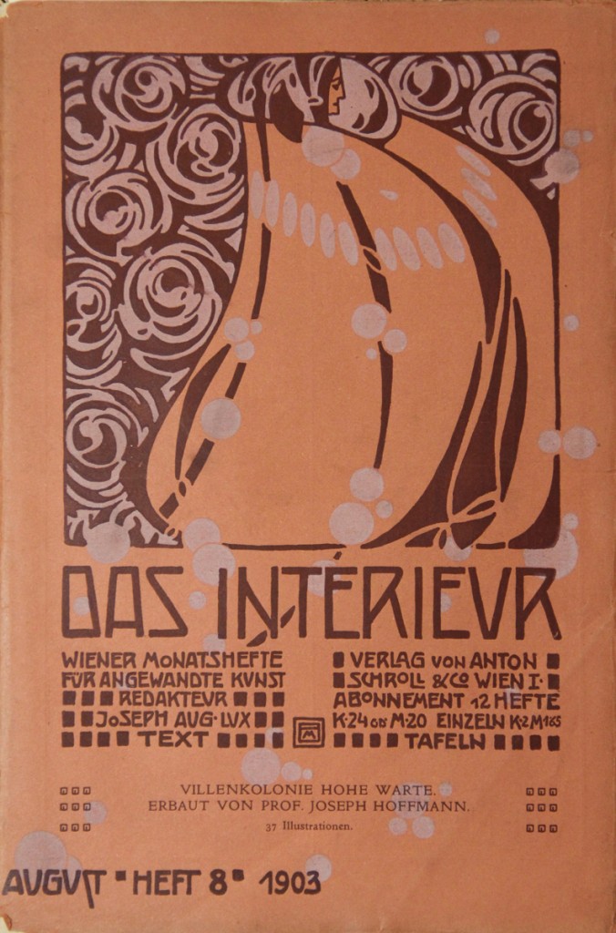 The turn of the century also saw the rise of magazines focusing on decorative arts and interior design. Magazines like Das Interieur, Die Kunst für Alle, and Innen Dekoration (Image #13, #14) took up the subject of interior design as a way of funding their publications– through the advertisements of designers and decorators within the magazines–but also as a way of promoting a reform of living whereby good design and craftsmanship should encompass all areas of one’s life.
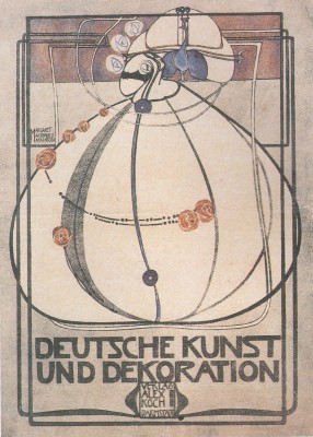
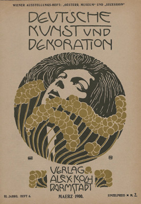
One of the biggest promoters of German interior design and architecture was publisher Alexander Koch who, using as his model the British Arts and Crafts magazine The Studio, established the journal Deutsche Kunst und Dekoration (German Art and Decoration). (1897–1935). Koch recognized the power of the art periodical to influence taste, particularly among a middle-class audience, saying: “Without our new art periodicals (there would be) no decorative art.” [10] Deutsche Kunst und Dekoration was his homage to Jugendstil, but also one of the first attempts to focus exclusively on interior design.
Devoted primarily to the applied arts, the journal took its cue from the ideas of the Vienna Secession by seeking to eliminate the distinction between decorative and fine arts, and artist and craftsman. Within the pages of a typical issue, one could find subjects ranging from ex-libris design, to type design, to metal-ware. The magazine also promoted the Vienna Secession’s exhibitions as well as covering the work of the Wiener Werkstätte in twelve special issues between October 1904 and March 1911. Unlike other interior design magazines that relied heavily on artists’ renderings and architectural drawings, Deutsche Kunst und Dekoration took full advantage of photographic reproductions. Using his magazine like a shop window, Koch brought the staged interior to prominence by arranging furniture and objects in ‘lived-in’ settings. In this way, Koch could promote furniture, textiles, metalwork and jewelry items in the photo, while also promoting the lifestyle associated with it.
-
- Cover by Margaret Macdonald
-
- Cover by Koloman Moser
-
- Cover by Hans Christiansen
Koch’s experience working for the typographer and printer Flinsch of Offenbach am Main, as well as his excellent drawing skills, meant that he also took a special interest in the design of the magazine. Like Jugend and Ver Sacrum, Deutsche Kunst und Dekoration allowed its featured artist to design the entire cover, thus reflecting Koch’s ideas of integration in the arts. In the first three years, there were cover designs by Hans Christiansen, Koloman Moser, Jan Toorop, Peter Behrens, and Margaret Macdonald Mackintosh.
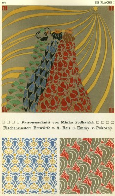
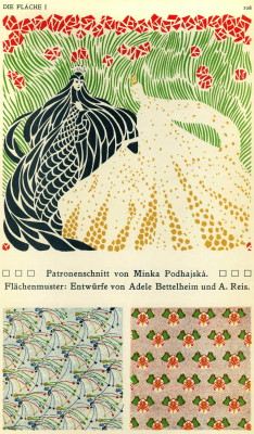
Decorative arts magazines also found a ready market in wallpaper and textiles as Japanese design and in turn, Art Nouveau rejuvenated people’s interest in pattern design. Japanese pattern; with its emphasis on flat visual planes, solid colours, tessellations, and linear outlines, was quickly incorporated by the Secessionists. Klimt, in particular, began to incorporate textile patterns and flat negative space into his work culminating from both his exposure to Japanese woodcuts and textile design and the Byzantine Mosaics he studied in Ravenna, Italy in 1903. This renewed interest culminated in new portfolios and magazines devoted exclusively to surface decoration such as Die Flache (The Surface), published in two volumes (1903/1904 and 1910) by Felician Baron Myrbac. Focusing entirely on surface decoration, the magazine is one of the best examples of Jugendstil graphic design with richly illustrated examples of pattern designs meant for textiles, wallpapers, poster art, and books. A second volume in 1910 by Bertold Löffler focused on poster design and illustration, and already the shift from Jugendstil to the Wiener Werkstatte-style, characterized by the simplified colour palettes and folk themes, is evident.
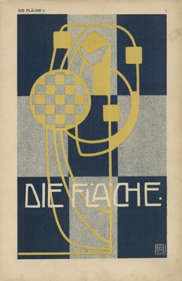
-
- Die Fläche
-
- Die Fläche
SIMPLICISSIMUS
In addition to decorative art magazines, late 19th century Germany and Austria also saw a rise in the popularity of satirical magazines. Known as ‘Witzblatter’, these weekly magazines combined humour and illustration to make light of changing political, social and cultural attitudes and used the political cartoon to appeal to a growing and politically active middle-class audience. The circulation numbers of some of these magazines reflect their popularity: Simplicissimus founded in 1896 had a circulation of 86,000 by 1908 while Jugend had roughly 70,000.[11]
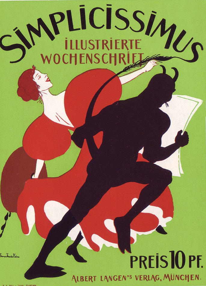 Perhaps the best-known satirical Journal from this period was Simplicissimus, founded by publisher Albert Langen in Munich, in 1896. Having an interest in avant-garde literature, Langen’s original vision was to create a magazine that promoted literary modernism but very quickly, Simplicissimus became a journal focusing on political satire. The title chosen for the magazine was a reference to a picaresque 17th-century novel by Johan Jakob Christoffel von Grimmels-Hausen which recounts the struggle for salvation of a naïve hero named Simplicissimus. Inspired by the events of the Thirty Years’ War, the hero struggles through the horrors of war, eventually denouncing the world as corrupt and becoming a hermit. This theme of humour in the face of horror would be at the heart of the magazine’s use of biting satire. Attacking militarism, religion, imperialism, the class system, and the authoritarian state, it wasn’t long before Simplicismuss became a symbol of anti-establishment among its young, middle-class educated readers. Unsurprisingly, the magazine earned several lawsuits such as the Palestine Affair of 1898, when the magazine featured cartoons mocking Kaiser Wilhelm’s trip there, as well as irreverent references to religious shrines and personalities. With the exception of this incident, which forced Langen to flee to Switzerland in order to avoid a prison sentence, most lawsuits resulted in small fines and undoubtedly helped to spread the popularity of the magazine even further through media attention.
It was Simplicissimus’ strong emphasis on the visual—it included more cartoons than any other contemporary satire magazine—which led to its success. The popularity of the political cartoon can be traced to the change in reading habits from the rise of urbanization at the turn of the century. Because of longer working hours and commutes to and from work, people had less time for leisurely reading and newspapers and magazines soon replaced books as the main source of reading material. The cartoon became an even faster way of engaging the reader as it could be enjoyed on a commuter train, streetcar, or during a rushed breakfast.
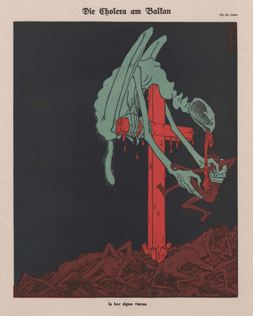 The best-known of Simplicissimus’ illustrators was Thomas Theodore Heine, an illustrator from a wealthy Jewish family in Leipzig. The fact that Heine also received a prison sentence during the Palestine affair showed how potent the political cartoon was at the turn of the century in Germany. Critics found Heine’s cartoons grotesque and enigmatic, and criticized his cruel depiction of the poor, contrasting it with Kathe Kollwitz’s more sympathetic depictions. By the standards of the day, Heine’s illustration would have indeed been considered violent. From a five-headed monster devouring the intestines of a man, to a dog tearing at the throats of small children, Heine sought to depict the military violence and exploitation of the poor with stark honesty—something the Neue Sachlichkeit (New Objectivity) artists like George Grosz and Otto Dix would pick up on two decades later. Reacting to Heine’s cartoons, critics jumped at the opportunity to attack the magazine’s ‘Jewishness’, in spite of the fact that he was the only Jewish illustrator employed at the magazine. Many Germans associated modernism and, in turn, the cultural decline of Germany with Jews. In their eyes, it was the Jews–the main promoters of rationalism and liberalism–who were corrupting German values established by German Romanticism.[12]
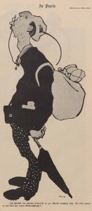
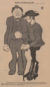
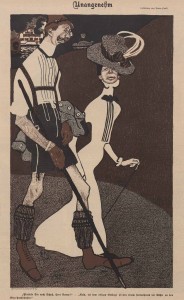
While Heine contributed to the political influence of the magazine, it was the illustrator Bruno Paul who contributed to the magazine’s modern visual style. A prolific illustrator, architect and furniture designer, Paul had been one of the founding members of the Munich Secession where he’d rubbed shoulders with leading Jugendstil artists Franz von Stuck, Angelo Jank and Paul Hoecker. It was through his connections in the Munich Secession that he began illustrating first for art and humour magazine Jugend in 1896, and then Simplicissmus in 1897- bringing with him his unique Jugendstil style. Paul’s illustrations are dominated by their undulating contour lines, flat fields of colour, and pattern; all distinct traits of Jugendstil. When we juxtapose these Art Nouveau elements with the exaggerated poses and caricatures of his subjects, we are reminded of the work of the Expressionist painter Egon Schiele who began to distort the figure and depict the grotesque.
-
- Bruno Paul illustration for Simplicissimus
Throughout the Weimar Republic, Simplicissimus continued to attack political repression and religious intolerance, adding to its targets the rise of National Socialism and anti-semitism. Eventually after years of attacks and threats on the staff, the national socialists managed to take over the magazine, forcing its editors Franz Schoenberner and Thomas Thoedore Heine into exile abroad. Many of the original staff such as Karl Arnold, Olaf Gulbransson, Edward Thöny, Erich Schilling and Wilhelm Schulz chose to remain and conform to the Nazi party line. After several years of a decline in publishing, the magazine finally ceased publication in 1944.
MEGGENDORFER BLATTER
In order to appeal to a modern-thinking audience, many of these Witzblatter aligned themselves with Jugendstil and used cartoons to poke fun at the tension between conservatism and modernism in the arts. One such example was Meggendorfer Blätter (1847–1925), which had a roster of Jugendstil illustrators including Koloman Moser, Josef Hoffmann, Gottlieb Theodore von Kempf, and Mila Von Luttich. (Image #20, 21) Considered the unsung hero of Secession-style graphic art partly because of the Vienna Secession’s prohibition of female members, Luttich produced stunning Secession-style illustrations for the magazine showing a synthesis of pattern design and typography that was unmatched by her male contemporaries. Her illustrations also mocked the very excessive stylization of Secession typography and interior. In one cartoon, an older man scratches his head unable to decipher the new Secessionist typefaces appearing on posters. In another, a young woman uneasily prepares to lie down on a nightmarish Secessionist-style pillow.
-
- Mila Von Luttich
-
- ‘Secessionist Pillow’ by Mila Von Luttich
QUER SACRUM
We tend to think of the Vienna Secession as a small breakaway group that existed on the fringes of mainstream Austrian art, yet a study of historical documentation reveals a different story. When we examine magazines and newspapers from this period, it is striking how much attention is given to Jugendstil and the Vienna Secession, even if that attention is often in the form of mockery rather than flattery. Historian Ann Taylor Allen writes that “In every society (humour) sensitively reflects the tension between conservatism and radicalism, conformity and rebellion.”[13] In other words, humour and satire were also a way for the public to engage with modernism without appearing to be anti-establishment. The attention given to the Secession in these magazines is also a testament to how much its ideas had spread throughout Viennese society in such a short period of time. Secession was á la mode and rapidly becoming part of mainstream cultural Vienna, even though the public was not yet ready to admit it.
One satirical publication that reveals the growing popularity of the Vienna Secession, was Quer Sacrum- Organ der Vereingun Bilder Kunstler, (Skewed Spring: Journal of the Union of Fine Arts of Crazyland) produced in 1899 as a parody of the Secession and its journal Ver Sacrum. The chief illustrator was Bertold Löffler, a student of Koloman Moser who would go on to become an important figure in the Wiener Werkstätte – the decorative arts company formed in 1903 by Moser and Josef Hoffmann. Like Ver Sacrum, the magazine was square in format and featured illustrations done in the style of Hoffmann and Moser. The cover illustration mocked the Secessionist’s adoption of historicism, by parodying Klimt’s 1898 painting Pallas Athena. Rather than holding a female nude as the ideal of beauty in art, Löffler’s Athena holds an artist with palette and broom, mocking the Secessionist’s claim to be a reformer in the Visual arts—cleaning out the old to make way for the new. Accompanying the title on the cover, Löffler puts as the location Bründlefeld, the site of the main insane asylum in Vienna. Like Mila von Luttich, Löffler also mocked excessive stylizing in favour of functionalism within Secessionist design, reproducing a Josef Hoffmann design for an entranceway and re-labelling it as an “Easy chair for my Grandfather”. The fact that Ver Sacrum’s original illustrations, text, and images were not reproduced in Quer Sacrum, implies that a large amount of the public were already familiar with its content and could enjoy the parodies offered by Löffler.
-
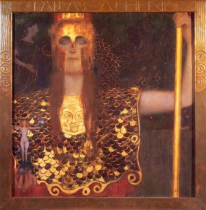
- Gustav Klimt- Pallas Athena
-
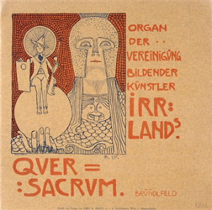
- Quer Sacrum- By Bertold Löffler
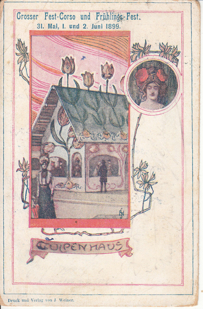
Postcard showing the ‘Tulip Haus’ at the Grosser Fest-Corso und Frühlings-Fest
The event surrounding the publication of Quer Sacrum is further evidence of how widespread the Vienna Secession was at the time. The magazine was distributed at the Grosser Fest-Corso und Frühlings-Fest—a charity event organized by Pauline Sandor von Matternich and held on June 1 and 2, 1899, on the grounds of the Prater in Vienna. The festival was a large-scale parody of the Secession, complete with a ‘Secessionist village’ designed by Burgtheatre stage designer Gilbert Lehner (1844-1923) and housing examples of ‘dysfunctional’ architecture such as an upside-down house, a tulip-house. The village even had a café where waitresses wore headdresses modeled after the Secession building’s gold-leaf dome and, as a further jab at the Secession, served only “lukewarm coffee”. Women wore flower and vegetable-patterned costumes based on drawings by Koloman Moser and Joseph Engelhardt, while others simply expressed their ‘secessionist’ nature with hand-made hats made from coloured folded paper. [14] In all 150,000 people passed through by the second day and papers like the the Neue Freie Press claimed the ‘Secessionist Village’ had so many visitors by the second day, there was only standing room.
The prevalence of Secession-themed cartoons in magazines and the Prater festival shows how popular the Vienna Secession had become in such a short time. This is reflected in an article by journalist Ludwig Hevesi for the July 1899 issue of Ver Sacrum, just one month after the festival on the Prater. He writes: “In the last year, the whole of Vienna has become ‘Secessionist’…In old established circles, one tries to roll together the last remains of one’s youthful dough and put new life into it; those same things which only a couple of years ago were rejected as quite unacceptable now win prizes.” [15]
Years later, Moser also recounted how the Secession had become a craze and shops everywhere began to sell bad copies of secessionist work. “It had become a trend, an entire industry; the originals were imitated in a careless and tasteless fashion, and there we had in Vienna that ‘false Secession’ of which Bahr so rightly warned us.” [16] This insight explains the motivation of Hoffmann and Moser to found the company Wiener Werkstätte in 1903 in order to ‘reclaim’ the style by producing high-quality Secession-styles wares.
To this day, research on Art Nouveau magazines remains limited, largely the result of historians not regarding illustration and humour as ‘serious’ areas of study. Nevertheless, it is an important subject that provides a unique window into the social attitudes towards Jugendstil as it transitioned from an outsider to a mainstream style.
[hr]
Notes
[1] Ann Taylor Allen, A Playful Judgement: The Social function of Satire & Society in Wilhelme Germany, Kadderatsche and Simplicissimus 1890-1914, 3.
[2] Paul Hofmann, Viennese: Splendor, Twilight and Exile (New York, Anchor Books Press, 1988), p. 42
[3] Philip B. Meggs, Alston W. Purvis, Meggs’ History of Graphic Design (John Wiley & Sons, 2016), p. 239
[4] Walter Crane, Of the Decorative Illustration of Books Old and New, pg. 266
[5] Alfred Roller, Notes of the Secession meetings kept by Roller in personal notebooks. (Alfred Roller archive, Osterreischisches Theatre Museum, Vienna: AR6).
[6] Jeremy Aynsley, Graphic Design in Germany: 1890–1945 (Los Angeles, University of California Press, 2000), p. 12
[7] Ver Sacrum, January 1898, 24.
[8] Karnes, Kevin C. A Kingdom of this World: Wagner and the Arts, and Utopian Vision of Fin de Siecle Vienna p. 78
[9] Victoria Charles, Klaus H. Carl, Vienesse Secession
[10] Heather Hess, The Wiener Werkstätte and the Reform Impulse, pg. 116
[11] Ann Taylor Allen, A Playful Judgement: The Social function of Satire & Society in Wilhelme Germany, Kadderatsche and Simplicissimus 1890-1914, p.3
[12] Fritz Stern, The Politics of Cultural Despair: A Study of the Rise of Germanic Ideology (Berkely, 1961) p. 142
[13] Ann Taylor Allen, A Playful Judgement: The Social function of Satire & Society in Wilhelme Germany, Kadderatsche and Simplicissimus 1890-1914, p.1
[14] Wiener Salonblatt, Jahresübersicht, June 3, 1899
[15] Ludwig Hevesi, Zwei Jahre Secessio’, Ver Sacrum, II, (1899) p.7
15 Mein Werdegang, Velhagen und Klasings Monatsheft, 31, ii. (Oct. 1916) p.17
Bibliography
Allen, Ann Taylor A Playful Judgement: The Social function of Satire & Society in Wilhelme Germany, Kadderatsche and Simplicissimus 1890-1914, Kentucky: The University Press of Kentucky, 1984.
Aynsley, Jeremy Design Change: Magazine for Domestic Interior, 1890-1930, Oxford University Press, 2005
Aynsley, Jeremy Graphic Design in Germany: 1890–1945, Los Angeles: University of California Press, 2000
Blaszczyk, Regina Lee (editor), Producing Fashion: Commerce, Culture, and Consumers, University of Pennsylvania Press, 1988.
Brooker, Peter, The Oxford Critical and Cultural History of Modernist Magazines: Volume 3, Oxford University Press, 2013.
Heather Hess, The Wiener Werkstätte and the Reform Impulse, pg. 116
Hofmann, Paul Viennese: Splendor, Twilight and Exile, New York: Anchor Books Press, 1988
Johnson, Julie M. Athena Goes to the Prater: Parodying Ancients and Moderns at the Vienna Secession, Oxford Art Journal, 26. 2, 2003, 47-70
Boris Manner, Oswald Panagl (editors) Scherz, Satire, Ironie und tiefere Bedeutung, Vienna: Lit Verlag Gmbh & co., 2015
Rennhafer, Maria, Kunstzeitschriften der Jahrhunderwende in Deutschland und Österreich 1895-1914, Bechtermünz Verlag, 1997
Stern, Fritz The Politics of Cultural Despair: A study of the Rise of Germanic Ideology, Berkely: University of California Press, 1961
Vergo, Peter, Art in Vienna 1898–1918: Klimt, Kokoschka, Schiele and their contemporaries, London: Phaidon Press Limited, 1975
[hr]
© 2017, Roberto Rosenman