
The Vienna Secession postcards produced for the 1898 exhibition represented a new and progressive form of advertising. Unlike traditional picture postcards, which typically featured picturesque views and tourist attractions, these cards embodied the graphic ambitions of the Vienna Secession through their innovative integration of image, typography, and symbolism. In doing so, they transformed a mass-produced object into a vehicle for avant-garde ideas.
A total of thirteen postcards were produced, the majority designed by Koloman Moser, who served as the Secession’s principal graphic designer and oversaw its official journal, Ver Sacrum. Additional contributions came from artists including Josef Hoffmann and Adolf Böhm. While the postcards functioned as promotional material for the Secession’s exhibitions and publications, they also became experimental design objects that challenged conventional approaches to visual communication. Their innovative use of typography, asymmetrical composition, and negative space anticipated principles that would later become central to modernist graphic design.
The Rise of the Picture Postcard
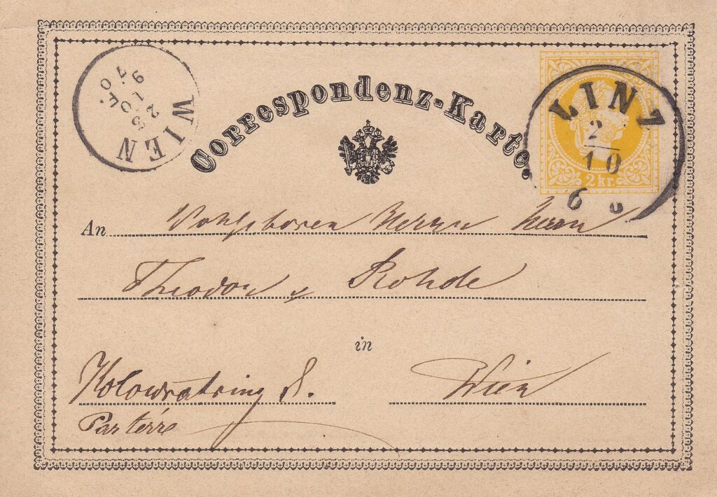
The concept of the postcard was first proposed by Dr. Emanuel Herrmann, a professor of political economics, in an article published in the Neue Freie Presse on January 26, 1869. In it, Herrmann outlined the economic advantages of a new form of postal correspondence whereby an envelope-sized card containing twenty words or fewer could be mailed anywhere within the Austro-Hungarian Empire for two kreuzers—less than half the cost of sending a standard letter.
On October 1, 1869, the first Correspondenz-Karte entered postal circulation. The idea proved immediately successful. Within three months, more than three million postcards had been sold, and postal authorities throughout Europe quickly adopted similar systems.
-
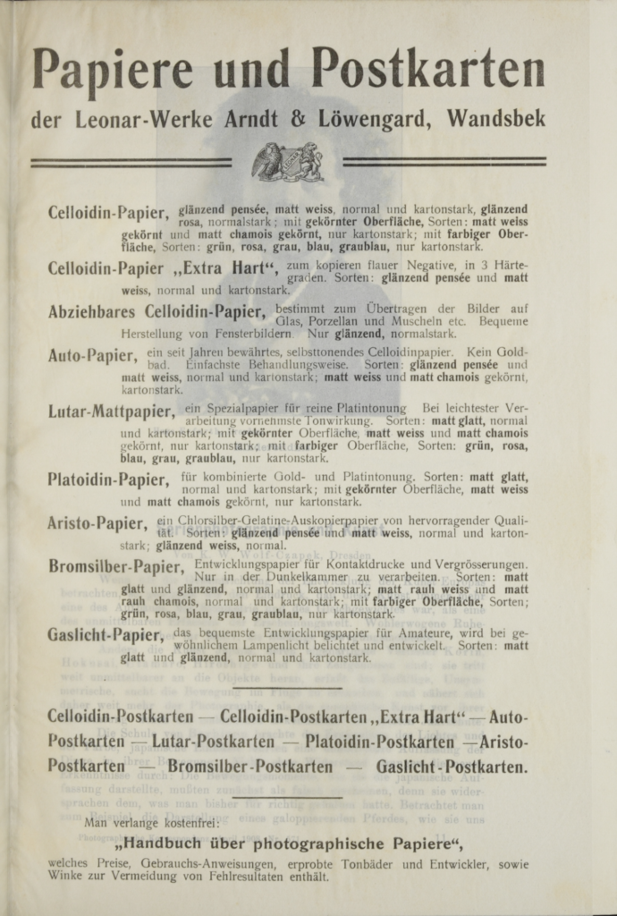
- “Papiere und Postkarten’- One of the many Printing Houses in Germany specializing in postcards printing techniques
Germany soon emerged as the dominant force in postcard production due to its inexpensive labour, low manufacturing costs, and highly advanced printing industry. Many of the most significant innovations in collotype printing originated there, including the three-colour collotype process introduced in 1874 and the six-plate Hoeschtype process developed in 1882. By 1907, German publishers exported more than 500 million picture postcards annually to the United States, with much of this trade controlled by the Berlin- and Dresden-based firm Stengel & Co.
Specialized printing houses marketed postcards through mail-order catalogues, organizing them into themed series identified by catalogue numbers. Between 1898 and 1918, often referred to as the “Golden Age of Postcards,” the medium became one of the most popular forms of visual communication. Germans mailed more than twelve million postcards during the first six months of 1898; within four years, that quantity was being sent in a single week. In 1903 alone, more than one billion postcards passed through the German postal system. The postcard had become a defining symbol of modern life, and the world’s first social network.
Artist Collectives and the Secessionist Movement
The popularity of postcards coincided with the emergence of new artist collectives throughout Central Europe. Groups such as the Vienna Secession, Berlin Secession, Munich Secession, and Hagenbund arose in opposition to government-sponsored art institutions that often rejected contemporary artistic experimentation. By establishing their own exhibition spaces and publications, these organizations provided opportunities for artists who had previously been excluded from official venues.
The collaborative nature of these groups also challenged traditional notions of artistic authorship. Rather than emphasizing the individual genius of a single artist, many projects were produced collectively. Moser and Hoffmann, for example, had already collaborated on illustrations and postcard designs for the satirical magazine Meggendorfer Blätter and for the publisher Philipp Kramer under the name Siebener Club. Their shared monogram became a recognizable symbol of collective artistic production.
The notion that multiple artists could contribute to a single design project represented a significant departure from nineteenth-century ideas of artistic autonomy. The Ver Sacrum postcards emerged directly from this collaborative culture and reflected the Secessionists’ broader desire to dissolve boundaries between the fine and applied arts.
Reimagining the Postcard Format

Koloman Moser and Josef Hoffman began collaborating for the magazine Meggendorfer Blätter and later on postcard designs for the publisher Philipp & Kramer. (Meggendorfer Blätter, 1898)
The Ver Sacrum postcards pushed the boundaries of conventional postcard design while contributing to the gradual erosion of distinctions between “high” art and popular visual culture. Their innovations were driven in part by a practical problem: the increasing demand for writing space.
Early picture postcards typically featured a full-page image on one side and reserved the reverse for correspondence. This arrangement reflected a museum-oriented conception of art as an object intended primarily for viewing rather than interaction. Examining surviving examples from the late nineteenth century reveals how frequently senders struggled to fit messages into the limited space available on the back of the card.
Art Nouveau designers responded creatively to this challenge. Influenced in part by Japanese woodblock prints, which often incorporated signatures and inscriptions directly into the image, artists began integrating writing areas into the overall composition. Initially, postcards divided the surface into separate zones for text and illustration, often allocating half or three-quarters of the card to the image. Over time, however, designers increasingly blurred these boundaries.
Hair, clothing, decorative motifs, and other pictorial elements began to extend into the writing area, while figures occasionally appeared to interact playfully with the space reserved for correspondence. Rather than treating text as an intrusion upon the image, designers incorporated it into the visual structure of the composition. This approach addressed a functional need while simultaneously creating more dynamic relationships between positive and negative space.
The Ver Sacrum postcards represent one of the most sophisticated examples of this development. By encouraging handwritten messages to become part of the overall composition, they transformed the postcard into an interactive object. The sender was no longer merely a spectator but an active participant whose words completed the design.
Negative Space and Asymmetrical Composition
Perhaps the most significant contribution of the Ver Sacrum postcards was their innovative use of asymmetrical composition and negative space. Nearly every design abandons the symmetrical arrangements that characterized much Art Nouveau graphic design.
Traditional Art Nouveau compositions frequently relied upon centred text blocks framed by decorative borders. While visually balanced, these layouts often left only narrow margins available for correspondence. Moser addressed this limitation by shifting images and typography toward one side of the card, creating large open areas that could accommodate written messages without reducing the scale of the illustration.
The resulting compositions retained many characteristic features of Art Nouveau—including curvilinear forms, ornamental line work, and flat areas of colour—yet their underlying structure was remarkably innovative. Images and text were offset to one side, creating asymmetrical balance and expansive fields of negative space that functioned simultaneously as writing surfaces and compositional elements.
The square image format favoured by the Secessionists further disrupted the traditional horizontal structure of the postcard while echoing the proportions of Ver Sacrum. Moser’s interest in typography, influenced by the teachings of Rudolf von Larisch, is evident in the custom high-waisted letterforms that appear throughout the series. Typography functions not as a caption but as a visual element equal in importance to the illustration itself.
Viewed today, these compositions appear surprisingly modern. With their asymmetrical organization, strategic use of empty space, and integration of typography, one might easily mistake them for one of Jan Tschichold’s grids experiments from Die Neue Typogaphie in 1928. Although developed in response to practical communication needs, the Ver Sacrum postcards foreshadowed many of the compositional strategies that would become fundamental to modern graphic design.
Legacy
The Ver Sacrum postcards demonstrated how a mass-produced object could function simultaneously as a work of art and a tool of communication. Through their integration of image, typography, and negative space, they challenged conventional expectations of both the postcard and the printed page.
More importantly, they reveal how functional constraints can become catalysts for formal innovation. The need to accommodate handwritten correspondence encouraged designers to rethink traditional compositional structures, resulting in experiments with asymmetry, typography, and spatial organization that anticipated later developments in modernist design.
By using the postcard as a vehicle for artistic promotion, the Vienna Secession established a model that would later be adopted by movements such as the Bauhaus and De Stijl, which similarly employed printed ephemera to disseminate new ideas beyond the gallery and museum. In this way, the Ver Sacrum postcards not only reflected the emergence of modern visual culture but also helped shape the future direction of graphic design itself.
A special thanks to Alastair Mason for kindly providing the scans below from his collection.
Roberto Rosenman, 2026
-
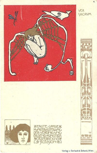
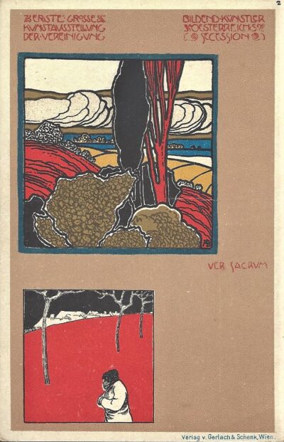
- Ver Sacrum Postcard #1, 1898. By Koloman Moser. © Collection of Alastair Mason
-
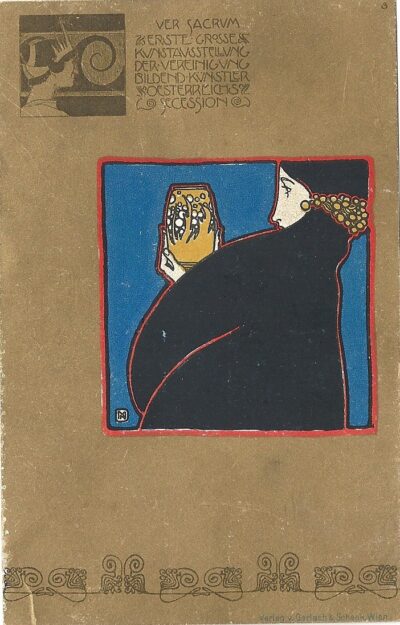
- Ver Sacrum Postcard #2, 1898. By A. Böhm. © Collection of Alastair Mason
-
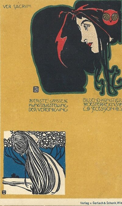
- Ver Sacrum Postcard #3, 1898. By Koloman Moser. © Collection of Alastair Mason
-
- Ver Sacrum Postcard #4, 1898. By Koloman Moser. © Collection of Alastair Mason
-
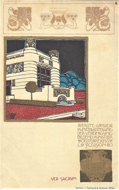
- Ver Sacrum Postcard #6, 1898. By Josef Hoffmann.© Collection of Alastair Mason
-
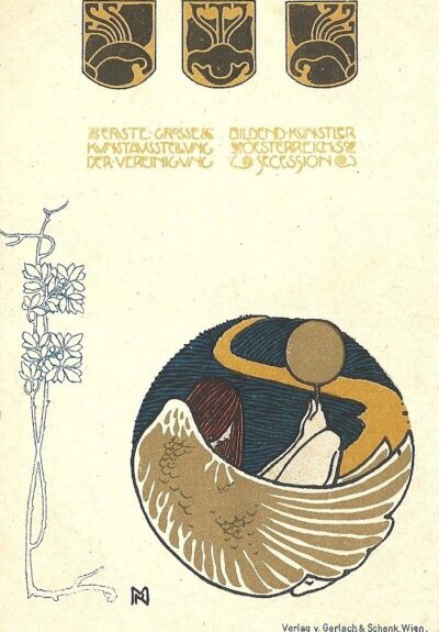
- Ver Sacrum Postcard #8, 1898. By Koloman Moser. © Collection of Alastair Mason
-
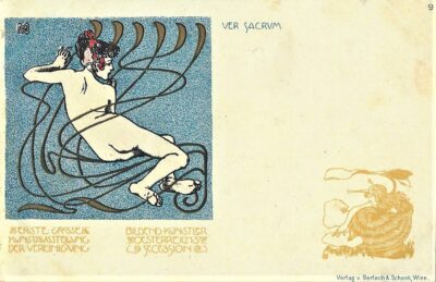
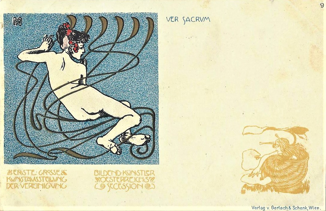
- Ver Sacrum Postcard #9, 1898. By Koloman Moser. © Collection of Alastair Mason
-
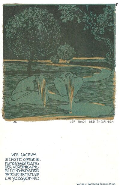
- Ver Sacrum Postcard #11, 1898. By Adolf Bohm. © Collection of Alastair Mason
-
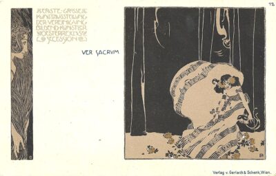
- Ver Sacrum Postcard #12, 1898. By Koloman Moser. © Collection of Alastair Mason
-
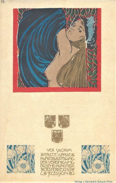
- Ver Sacrum Postcard #13, 1898. By Koloman Moser. © Collection of Alastair Mason
Leave a Reply