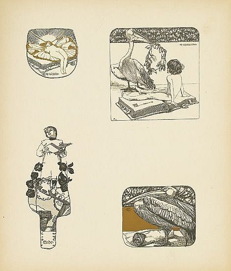
Carl Otto Czeschka- Die Quelle
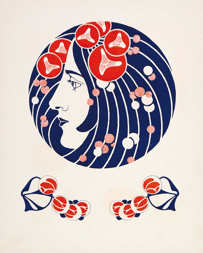
Max Benirschke- Die Quelle
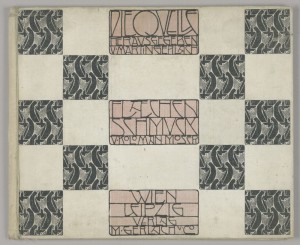
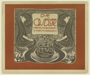
Published in Vienna at the beginning of the twentieth century, Die Quelle (The Source) is one of the most significant portfolios of the Vienna Secession and an important landmark in the history of graphic and decorative design. Conceived as a three-volume collection of ornamental designs, the publication brought together the work of Carl Otto Czeschka, Max Benirschke, and Koloman Moser. More than a collection of illustrations, Die Quelle proposed a new relationship between art, graphic design, and the applied arts.
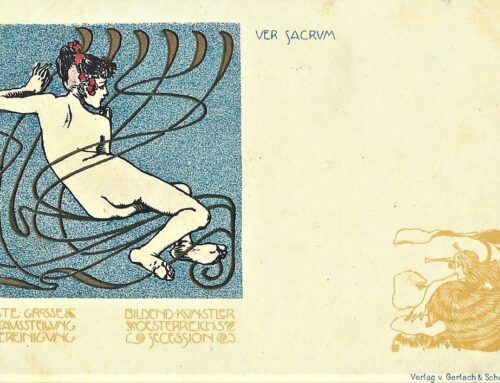
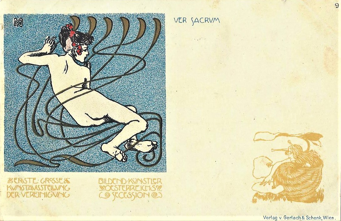
The man behind this project was the publisher Martin Gerlach- an engraver and photographer who opened a publishing house in 1874 in Vienna. Referred to by the art critic Joseph August as the “Führer der Moderne” (leader of modernism), Gerlach had aligned himself early on with the new Jugendstil style by collaborating with many of the Secession artists while many were still students. In 1896, he published the portfolio Allegorien-Neue Folge which featured contributions by Gustav Klimt, Carl Otto Czeschka, and Koloman Moser and later the 34-volume children’s books Gerlach’s Jugendbücherei of which Czeschka’s contribution, Die Niebelungen is considered one of the earliest examples of Wiener Werkstätte style. Gerlach’s close relationship with the emerging Secession would soon lead to one of his most important publishing projects: in 1898, in partnership with Ferdinand Schenk, his firm Gerlach & Schenk became the publisher of Ver Sacrum, the official journal of the newly formed Vienna Secession.
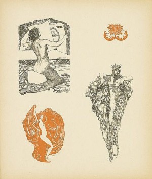
In 1900, Gerlach renewed his collaboration with Czeschka and Moser for Die Quelle, a new 3-volume portfolio devoted entirely to surface decoration. Czeschka was chosen to illustrate the first volume titled Vignetten (vignettes) which showed illustrations for everything from ex-libris to menu designs. Its approximately thirty plates presented a variety of graphic motifs, including illustrations, ex-libris designs, menus, and other forms of decorative graphic work. Rather than treating ornament as something secondary to typography or illustration, Czeschka integrated it into the overall composition. The result demonstrates the Secessionist interest in creating a unified visual language in which lettering, image, and ornament could function together.
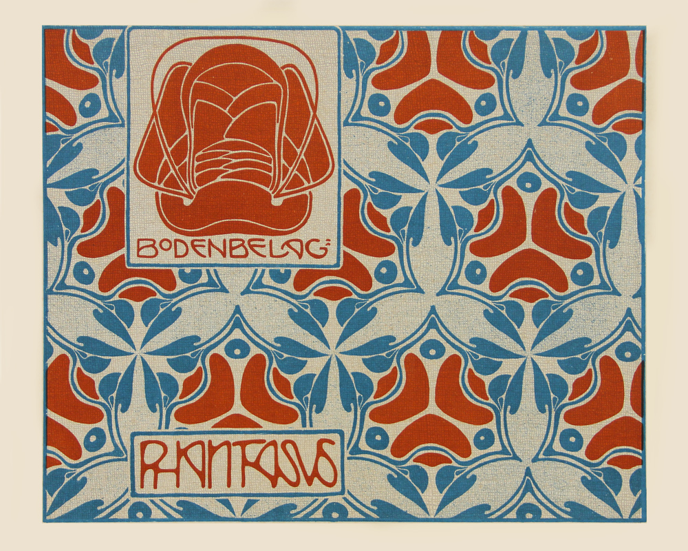
The second volume, Buchschmuck und Flächenmuster (Book Decoration and Surface Patterns), featured Max Benirschke. His designs are characterized by flowing botanical forms and rhythmic, curvilinear patterns typical of the Jugendstil. The plates were conceived as adaptable designs that could potentially be translated into textiles, ceramics, wallpaper, book decoration, and other applied arts. In this sense, Die Quelle functioned almost as a pattern library—a sourcebook from which designers and craftspeople could develop new objects and surfaces.
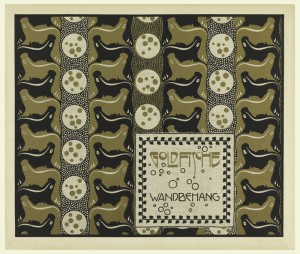
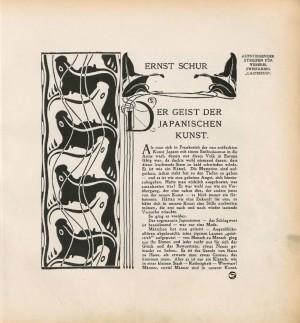
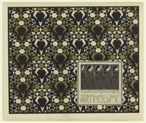
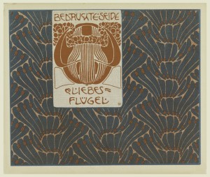
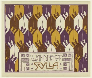
By far the most beautiful of the three volumes is Koloman Moser’s Flächenschmuck (planar ornamentation). This portfolio shows Moser at the height of his talent as a graphic designer with each of the 30 plates demonstrating a beautiful synthesis of type-design and ornamentation. Each colour plate was accompanied by a subtle grey pattern on the reverse side. Moser had, in fact, completed many of the designs a year earlier for the 4th Secession exhibition in 1899 and they were subsequently published in the Ver Sacrum issue (Heft 4) devoted to him later that year. Nevertheless, Die Quelle gave him an opportunity to expand on the designs by adding decorative text boxes and colour.
-
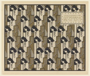
- Koloman Moser- Die Quelle
-
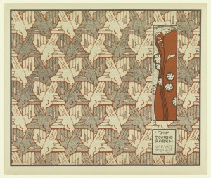
- Koloman Moser- Die Quelle
-
- Koloman Moser- Die Quelle
-
- Ver Sacrum, Koloman Moser, 1899
Many of the illustrations reflect Moser’s interest in Japanese textile design which he had already begun exploring as early as 1898 when he collaborated with the textile company Johan Backhausen & Söhne, which would later produce nearly all of the Secession and Wiener Werkstätte designs. As well, we see some the influence of Japanese and Turkish paper marbling techniques which Moser had been teaching to his students at the College of Applied Arts in Vienna. We also see the an early pre-occupation with tesselations and grids in his design for Die Tauusand Raben, Frau Nolda, and Donauwellen Wandekore. While the influence of art nouveau is very prevalent in Moser’s flower and plant patterns, we also glimpse the beginnings of his move towards geometric abstraction and the emphasis on the square (Wanddecor December and Wandbehag Die Riefezeit). In only a few years, Moser would almost completely abandon the curvilinear style of Art Nouveau seen in Die Quelle and the square would become the central motif of the Wiener Werkstatte.
The significance of Die Quelle extends beyond its individual plates. The portfolio helped establish the idea that the graphic designer could create a comprehensive visual vocabulary applicable across different media. A motif might appear on a book, textile, wall, piece of furniture, or architectural surface. Gerlach’s importance to Die Quelle becomes clearer when viewed within the broader publishing program he had developed over the previous two decades. His books were not simply collections of beautiful images; many functioned as visual repositories of motifs intended for practical use by artists, designers, craftspeople, and students. Publications such as Blumen und Pflanzen zur Verwendung für kunstgewerbliche Decorationsmotive und den Zeichenunterricht (1892) presented natural forms as sources for decorative invention, while other publications documented ornaments, folk art, monograms, plants, animals, and decorative compositions. Gerlach was therefore helping to establish a new way of thinking about ornament: not as incidental embellishment, but as a vocabulary that could be collected, studied, reproduced, and transformed. In this context, Die Quelle—literally “The Source”—seems almost like a summation of Gerlach’s publishing philosophy. At the same time, its emphasis on surface, repetition, typography, pattern, and reproducibility challenged the traditional distinction between fine art and applied art. Rather than simply decorating objects, these designers sought to give everyday visual culture a coherent artistic language. Die Quelle remains an extraordinary record of that ambition—and a literal “source” for understanding the development of twentieth-century graphic and decorative design.
R.Rosenman, 2026
[hr]
Franz, Rainald. Koloman Moser 1868-1918- Kolo Moser’s Pattern Design with Special Reference to the Design Portfolio “die Quelle” and his work as a designer for the Company Backhausen, London: Prestel for the Leopold Museum Private Foundation.
Reinhofer, Maria. Koloman Moser-Master of Viennese Modernism. Lodnon: Thames & Hudson Ltd. 2002
Franz, Rainald. Koloman Moser- Designing Modern Vienna 1897-1907- Graphic Art. New York: Prestel for the Neue Gallerie. 2013.
-
- Koloman Moser- Die Quelle
-
- Koloman Moser- Die Quelle
-
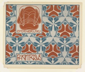
- Koloman Moser- Die Quelle
-
- Koloman Moser- Die Quelle
-
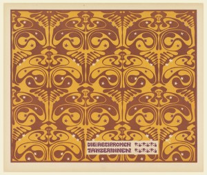
- Koloman Moser- Die Quelle
-
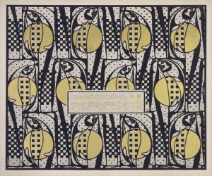
- Koloman Moser- Die Quelle
-
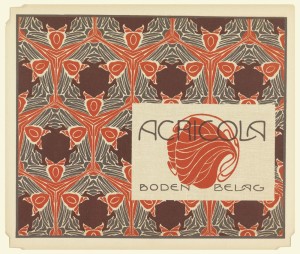
- Koloman Moser- Die Quelle
-
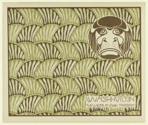
- Koloman Moser- Die Quelle
-
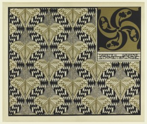
- Koloman Moser- Die Quelle
-
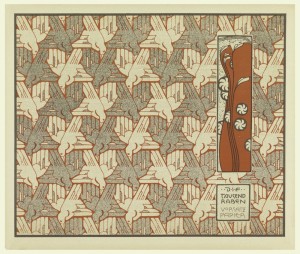
- Koloman Moser- Die Quelle
-
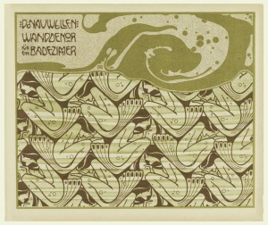
- Koloman Moser- Die Quelle
-
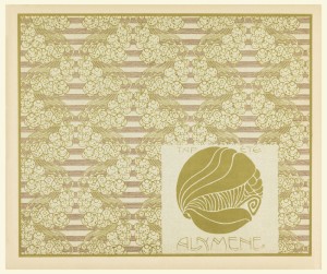
- Koloman Moser- Die Quelle
-
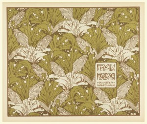
- Koloman Moser- Die Quelle
-
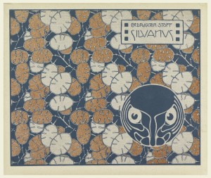
- Koloman Moser- Die Quelle
-
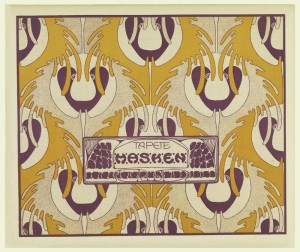
- Koloman Moser- Die Quelle
-
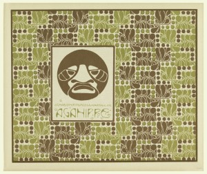
- Koloman Moser- Die Quelle
-
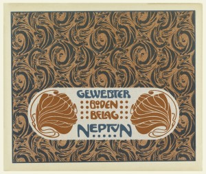
- Koloman Moser- Die Quelle
-
- Koloman Moser- Die Quelle
-
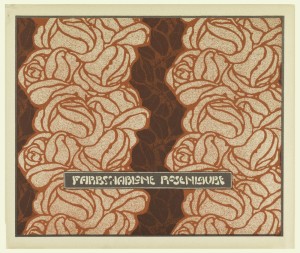
- Koloman Moser- Die Quelle
-
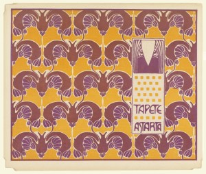
- Koloman Moser- Die Quelle
-
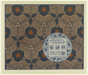
- Koloman Moser- Die Quelle
-
- Koloman Moser- Die Quelle
-
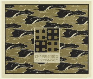
- Koloman Moser- Die Quelle
-
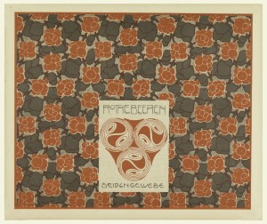
- Koloman Moser- Die Quelle
-
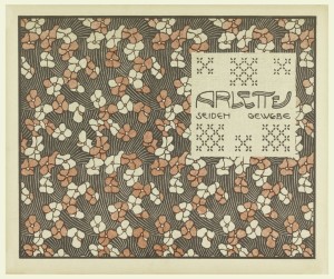
- Koloman Moser- Die Quelle
-
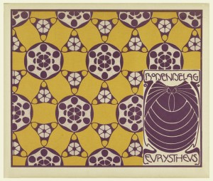
- Koloman Moser- Die Quelle
-
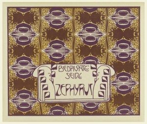
- Koloman Moser- Die Quelle
-
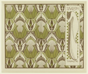
- Koloman Moser- Die Quelle
-
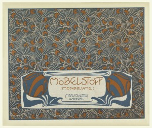
- Koloman Moser- Die Quelle
-
- Koloman Moser- Die Quelle
-
- Koloman Moser- Die Quelle
-
- Koloman Moser- Die Quelle
-
- Carl Otto Czeschka- Die Quelle
-
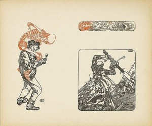
- Carl Otto Czeschka- Die Quelle
-
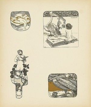
- Carl Otto Czeschka- Die Quelle
-
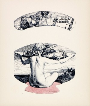
- Carl Otto Czeschka- Die Quelle
-
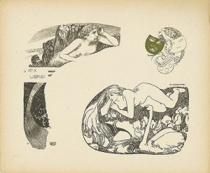
- Carl Otto Czeschka- Die Quelle
-
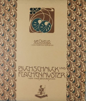
- Max Benirschke- Die Quelle
-
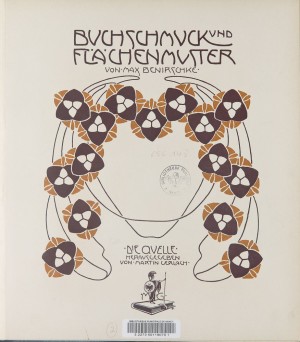
- Max Benirschke- Die Quelle
-
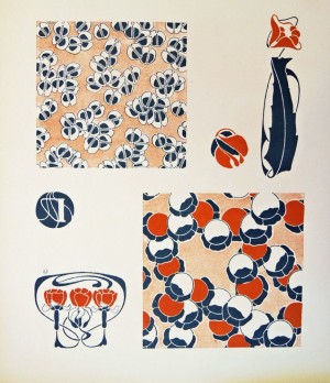
- Max Benirschke- Die Quelle
-
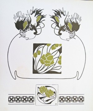
- Max Benirschke- Die Quelle
-
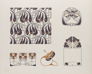
- Max Benirschke- Die Quelle
-
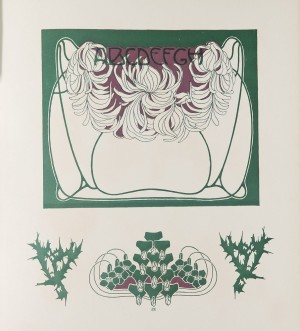
- Max Benirschke- Die Quelle
-
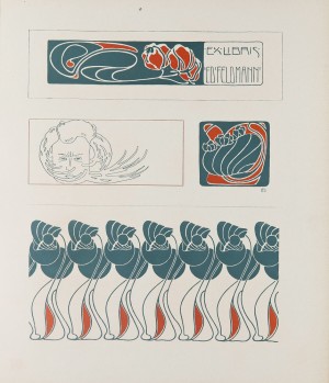
- Max Benirschke- Die Quelle
-
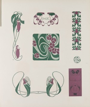
- Max Benirschke- Die Quelle
-
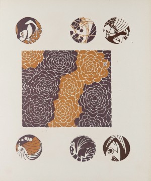
- Max Benirschke- Die Quelle
-
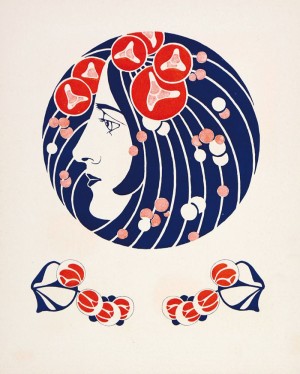
- Max Benirschke- Die Quelle
-
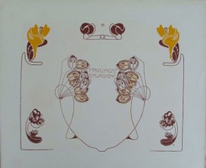
- Max Benirschke- Die Quelle
-
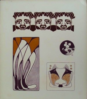
- Max Benirschke- Die Quelle
-
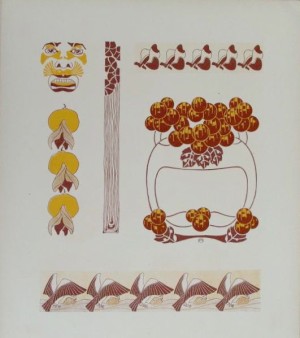
- Max Benirschke- Die Quelle